Why Open Floor Plans Need A Smart Paint Strategy
Color Mistakes That Make Large Spaces Feel Disconnected
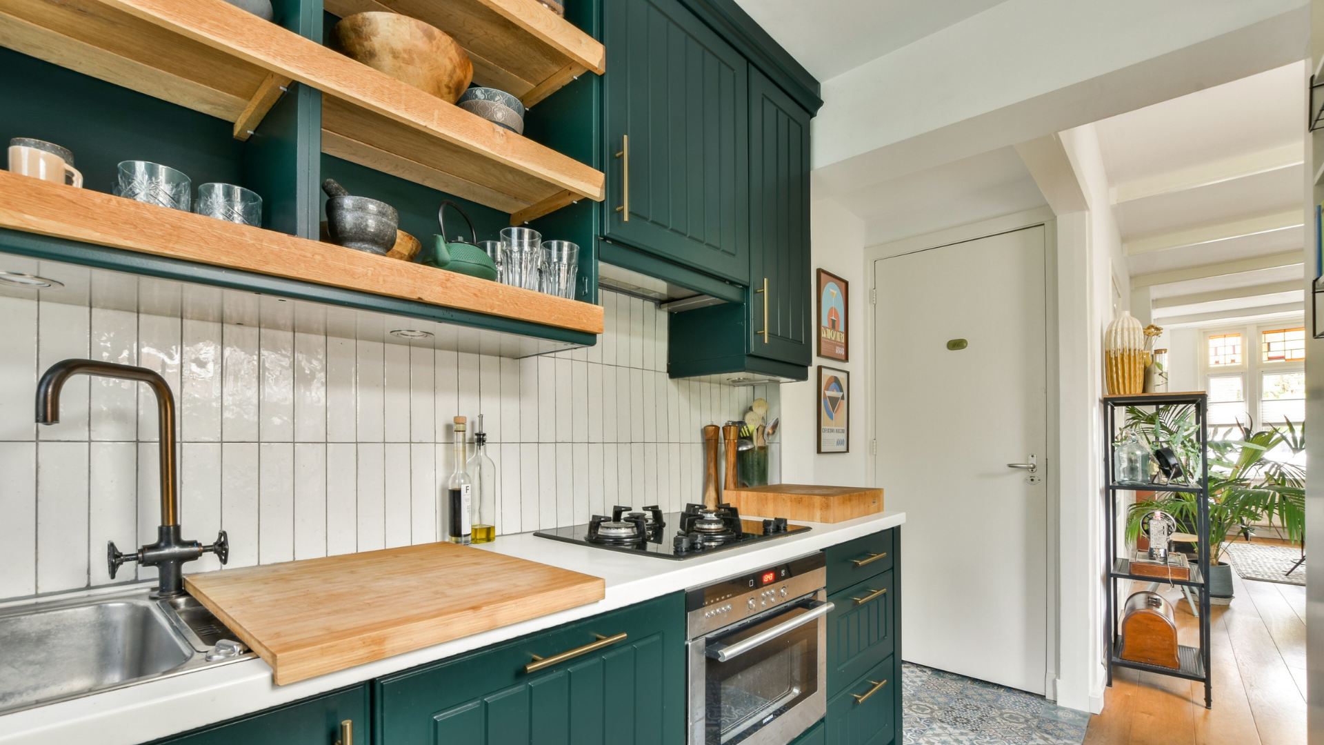
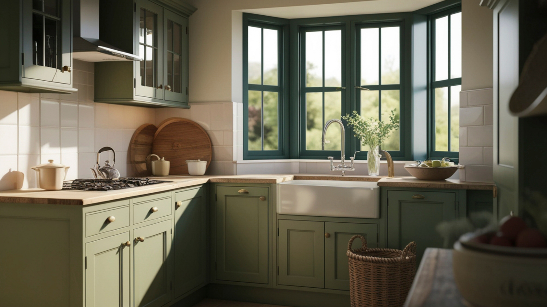
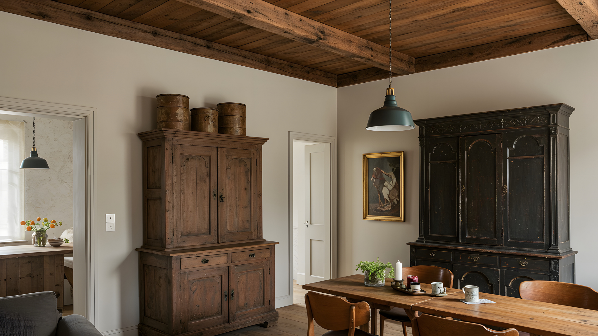
Open floor plans have become a hallmark of modern design, offering a sense of openness and connection that closed-off rooms can’t quite achieve. They bring people together, invite natural light, and make even smaller homes feel expansive. But this openness also brings a challenge that many homeowners overlook, which is how to use paint effectively in a space without traditional walls to guide the eye. When the kitchen, dining, and living areas flow into each other, paint becomes more than just decoration. It’s the language that defines where one area ends and another begins, while still keeping the conversation between them smooth and natural.
Without a coordinated plan, open layouts can feel disjointed, as if each section is fighting for attention. One bold wall here and a muted one there can throw off the balance entirely. On the other hand, too much of a single tone can make everything blend together in a way that feels flat or lifeless. Striking the right balance between variety and unity is what turns an open layout into something that feels cohesive, intentional, and inviting. That’s where a smart paint strategy comes into play.
When choosing colors for an open space, it’s important to think in terms of how people move through it. What’s visible from one area to the next? How does natural light shift throughout the day? The answers to these questions help determine how to layer hues so that they complement rather than compete. The goal isn’t to make every area identical, but to let each part have its own character while still belonging to the same story.
Using Color To Define Zones
One of the greatest benefits of open floor plans is flexibility. You can cook, entertain, or relax all in the same general area, but each zone still needs a clear sense of identity. Paint is one of the most effective ways to make that happen. A well-chosen color shift can gently suggest, “This is where we gather,” or “This is where we unwind,” without needing physical dividers.
For example, a soft, warm shade around the dining area can make meals feel intimate even in a large space, while a cool, serene hue near the living area can invite relaxation. The kitchen might call for a tone that reflects light and energy, something that sparks conversation and creativity. The key is subtlety. Colors should transition gracefully, not sharply. Think of it like blending tones in a piece of music. Each section has its own rhythm, but together they create a complete, harmonious composition.
Lighting plays a big role in this as well. A color that looks rich and balanced in one part of the room might appear washed out or overly intense in another depending on the light source. That’s why testing colors in different corners of the space can make such a difference. Observing how sunlight or artificial lighting interacts with the paint will help you fine-tune choices before committing to them.
Another smart approach is to use variations of one color family throughout the space. Slight shifts in shade, such as from a deeper hue in one zone to a lighter tone in another, can create visual boundaries without harsh lines. This keeps the open feel intact while still giving structure and order to the design.
Avoiding Common Painting Pitfalls
Even with a good sense of color, open layouts can quickly feel off-balance if transitions aren’t handled with care. One of the most common mistakes is choosing unrelated tones for adjoining areas. If the eye moves from one color to a completely different one without a bridge between them, it can feel abrupt and confusing. The space loses its rhythm. Another issue is the overuse of accent walls. While an accent can add personality, too many strong statements competing within one open area can overwhelm the space rather than enhance it.
There’s also the risk of using undertones that clash. Two neutral shades may look complementary on their own, but if one leans cool and the other warm, they can subtly conflict when viewed together. This often happens in spaces where walls connect or flow around corners. What looks fine in isolation can feel off once the entire layout is visible.
Transitions matter just as much as the colors themselves. Corners, ceiling lines, and trim can make or break the visual flow. If the color changes are too abrupt or poorly aligned, the layout begins to feel fragmented. Taking time to map out these transitions carefully ensures the design feels seamless.
Creating Flow Through Palette, Light, And Texture
A smart paint strategy doesn’t stop at color selection. It’s about orchestrating how every visual element works together. A coordinated palette sets the foundation, but details like trim, finish, and lighting complete the picture.
Using consistent trim colors throughout an open layout can unify the space. Even if wall shades vary, shared trim tones keep everything tied together visually. Soft, neutral trims tend to be a reliable choice because they act as a quiet backdrop that allows wall colors to shine without interruption.
Texture is another powerful tool for balance. Matte finishes can absorb light, creating warmth and depth, while satin or eggshell finishes bounce light around, adding energy and brightness. Combining these finishes strategically helps guide how the eye moves through the room. For instance, pairing a soft matte in a lounging area with a more reflective finish in the kitchen can make each space feel appropriate for its purpose without relying solely on color differences.
Lighting also defines how paint behaves. Recessed lighting, pendant fixtures, and natural sunlight all cast their own tone and intensity. Matching the right paint finish and hue to the lighting source helps prevent surprises after the project is complete. A room washed in warm afternoon light may benefit from cooler undertones to balance it out, while a north-facing area might need a touch of warmth to avoid feeling too stark.
When color, light, texture, and trim all come together in the right , the result is a home that feels naturally connected. Every area can have its personality, yet still contribute to a larger visual narrative.
Open floor plans succeed when design feels effortless, even though achieving that harmony requires careful thought. Paint plays a bigger role in that success than most people realize. It defines zones, builds flow, and shapes the emotional experience of the entire space. A thoughtful paint strategy turns an open concept from a collection of corners into a continuous environment that feels balanced, comfortable, and refined.
If you’re planning to refresh or redesign an open layout, it’s worth investing time in selecting the right palette, finishes, and transitions from the start. That’s where professional insight makes a real difference. At Gutierrez Painting, we understand the nuances that turn an open concept into a unified design. Our team brings expertise, precision, and a creative touch to every project, ensuring that color enhances, rather than complicates, not complicates, the beauty of your home.
Contact us today to discuss how we can help you craft a paint strategy that gives your open space both personality and flow.

