What Ceiling Color Does To The Feel Of A Room
Going Beyond White For Modern Ceiling Design
It’s easy to forget about what’s above us. Most of the attention goes to walls, furniture, floors—things within immediate sightlines. But the ceiling of a room has an underrated influence. Changing its color doesn’t just alter the aesthetics—it can completely shift how a space feels. From making rooms seem more expansive to giving them a snug, intimate vibe, that upper boundary quietly sets the tone.
Color above our heads has the potential to impact both perception and mood. Whether you’re going for height, comfort, or elegance, the paint choice up there plays a bigger role than most expect. A subtle adjustment can visually stretch a room, ground it with character, or polish off an entire interior design plan.
Light Shades And The Illusion Of Openness
Bright hues applied overhead reflect more natural and artificial light. That extra bounce softens shadows, lifts the atmosphere, and helps a room feel like it’s breathing a little easier. When the ceiling is light—especially a soft white, pale gray, or creamy beige—it tricks the eye into thinking the room is taller than it really is. This is especially useful in older homes or basement spaces that may not have the most generous vertical dimensions.
In smaller rooms, this approach works wonders. Instead of the ceiling feeling like it's pressing down, it seems to recede into the background. That visual lightness makes everything feel more open, giving the impression of added volume and energy.
It’s not just about how high the room appears. Lighter hues help amplify brightness, making daytime feel sunnier and evening hours feel cleaner and more ambient. Even in rooms with limited windows, this can elevate the mood significantly.
Going Dark For Drama And Comfort
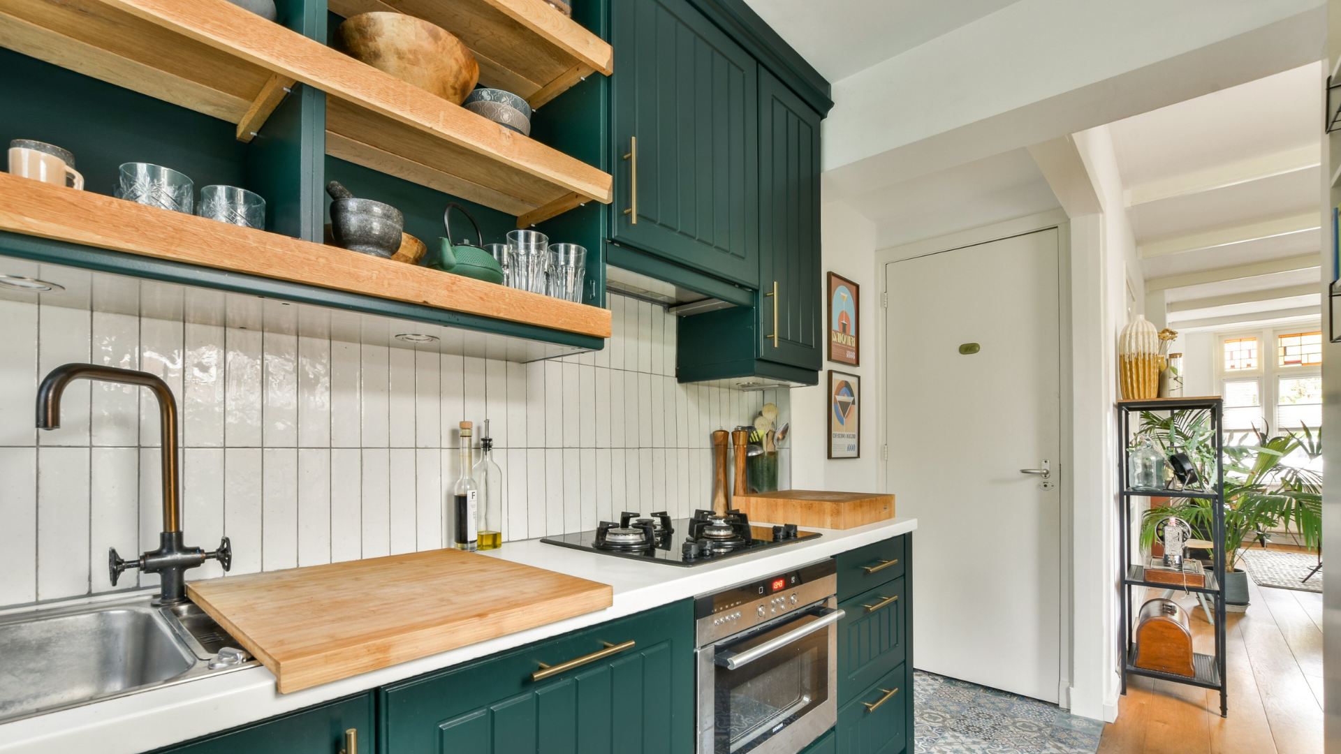
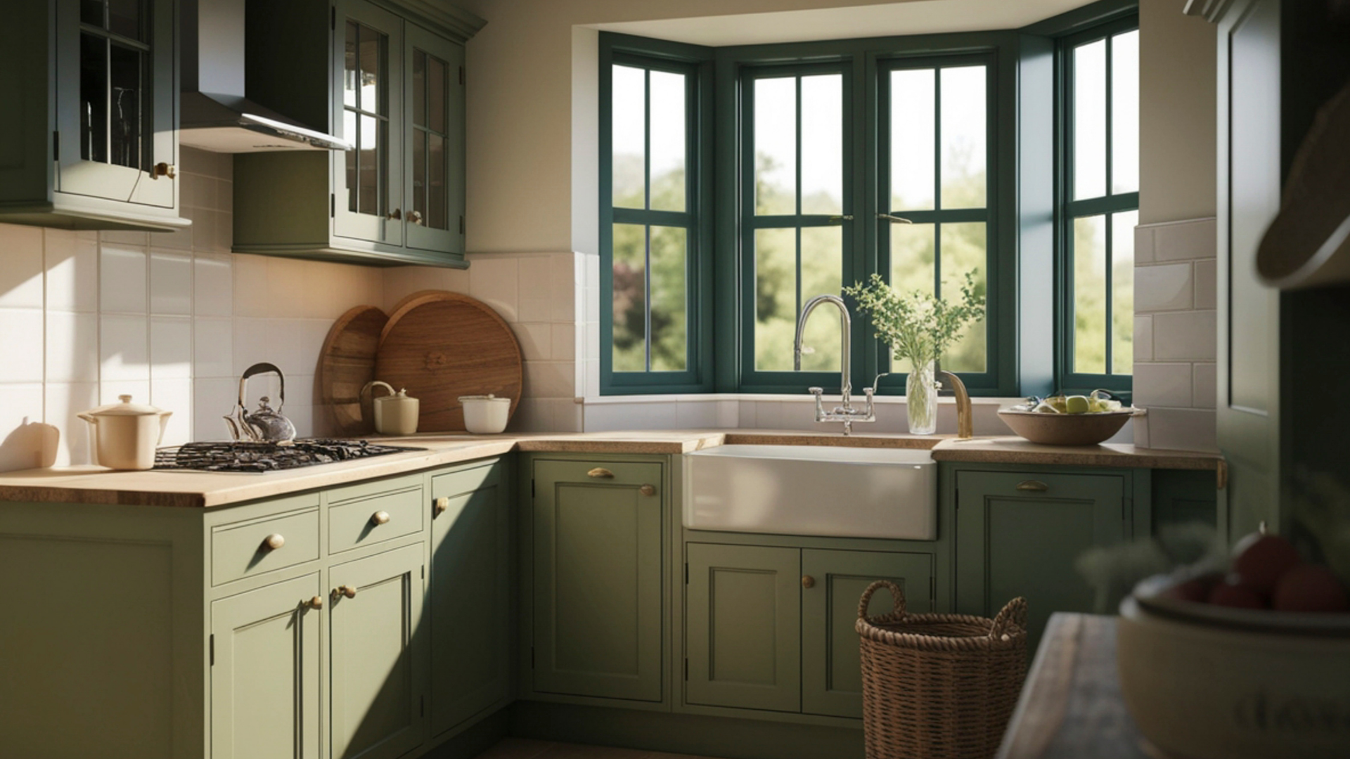
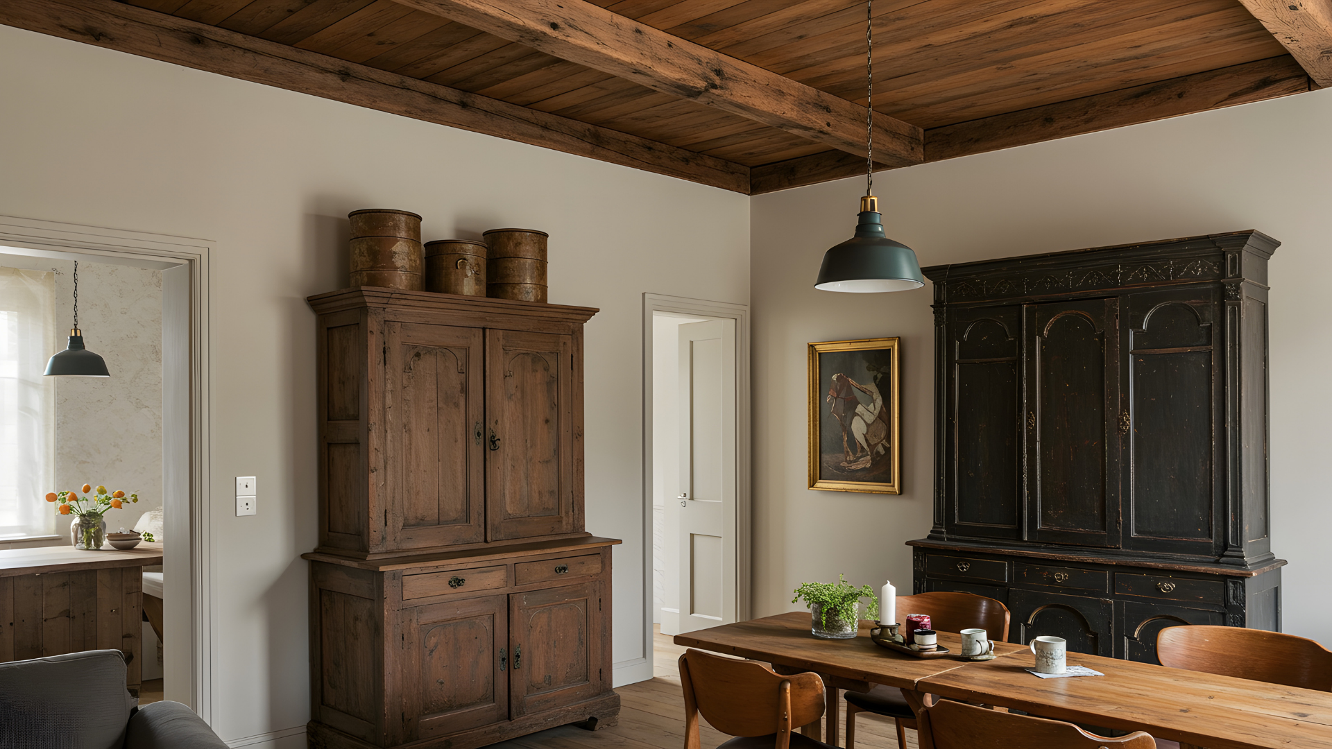
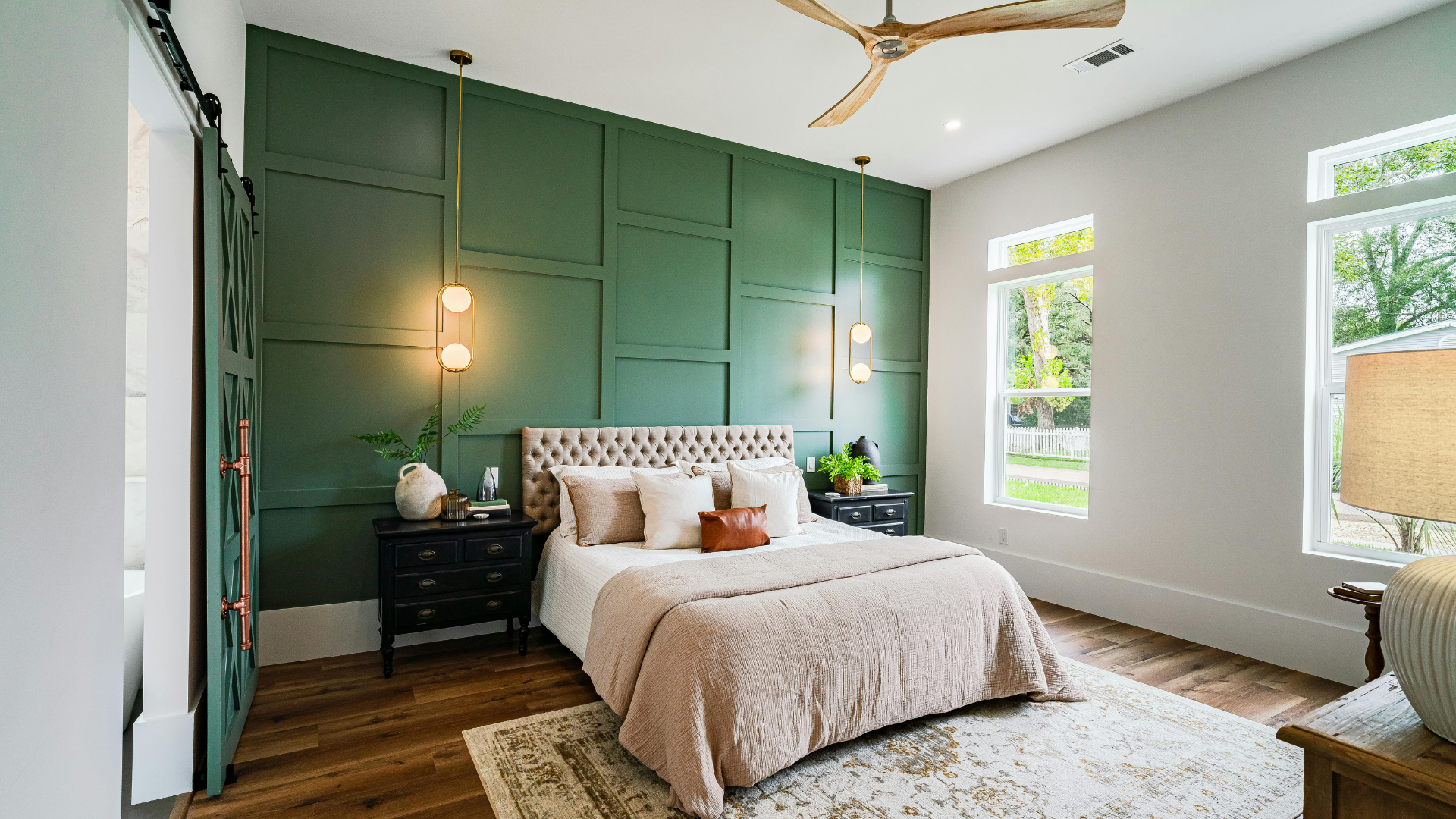
On the other hand, choosing a deeper color adds a whole different layer of personality. It’s a bold move—but one that brings a sense of intimacy and design flair. When the ceiling is painted in a rich tone like charcoal, navy, or even muted forest green, it draws things in—closing the distance between walls and top in a way that feels comforting rather than confined.
This technique works especially well in rooms with a lot of space or height. A darker shade overhead helps balance the openness, giving it warmth and cohesion. It creates a cocoon-like effect, wrapping the space with visual coziness that makes it feel inviting and intentionally designed.
There’s also a practical bonus here. A deeper color can conceal minor surface imperfections or distracting features like exposed ductwork or patchy textures. Instead of seeing scattered flaws, the eye reads the area as one consistent canvas.
Choosing a darker option doesn’t mean sacrificing brightness, either. Paired with layered lighting—wall sconces, pendant lights, or even a couple of strategically placed floor lamps—the effect can be both calming and luxe. It gives the impression that everything in the room has a place and purpose.
Color Strategy: Blend In Or Stand Out
Some designers opt to match the overhead tone with the walls for a monochromatic, immersive effect. This creates a seamless envelope of color that makes the entire room feel unified. It’s an especially appealing approach in modern interiors or compact spaces where visual continuity helps reduce clutter and distraction.
When everything from baseboards to crown moldings to the upper surface shares a tone, the eye glides across the room without stopping. This unified palette can actually make a space feel larger, even without a lot of square footage. It also emphasizes shapes and shadows in a way that feels architectural and intentional.
On the flip side, contrast can be equally compelling. A pale ceiling paired with darker walls draws the gaze upward, subtly reinforcing a sense of height. A softly colored surface above deep green or burgundy walls adds elegance. Conversely, using a rich shade above crisp white walls introduces drama and personality.
And then there are those bolder choices—the soft sky blues in sunrooms, dusty lilacs in bedrooms, or terra-cotta tones in eclectic kitchens. A pop of unexpected color up top can transform an otherwise quiet room into something unforgettable. It’s a fun and expressive way to show creativity without overcommitting to bold color elsewhere.
Finish, Texture, And Lighting Influence
Beyond shade selection, there’s also the matter of sheen. Most professionals recommend a flat or matte finish for overhead applications. These finishes help minimize glare and are more forgiving of surface inconsistencies. That said, satin or eggshell can work in high-moisture areas like kitchens or baths where easy cleanup is a priority.
Texture adds another layer of complexity. Traditional popcorn finishes are on the way out, with many homeowners opting for smoother applications or subtle patterns like knockdown or beadboard. These surface details, when paired with the right paint, give the room richness and depth.
Architectural features like trays, coffered beams, or decorative medallions benefit tremendously from thoughtful color placement. Highlighting these with contrasting tones or finishes gives them the spotlight they deserve. These design details often go unnoticed when everything overhead is left white by default.
Lighting—both natural and artificial—also plays a key role in how the chosen hue appears. Sunlight streaming in from clerestory windows can cast shifting tones throughout the day, while dimmable fixtures let you change the feel of the space after sunset. The same color can feel soft and welcoming at noon but become rich and dramatic by evening, depending on how it’s lit.
Let’s Elevate Your Room From The Top Down
A fresh coat of paint above your head does more than polish off a room—it reshapes it. Whether you want to stretch a space visually, wrap it in warmth, or make a statement, what’s overhead matters more than it gets credit for.
At Gutierrez Painting, we take a holistic approach to interiors. That means thinking beyond the basics and giving proper attention to every surface—including the one that completes the room from above. If you’re ready to explore how switching the ceiling color can change your space,
contact us today. We’d love to help you bring your vision full circle—from the ground up to the final finishing touch.