The One Color That Makes Every Room Look More Expensive
greige is A Timeless Hue That Elevates Almost Any Interior
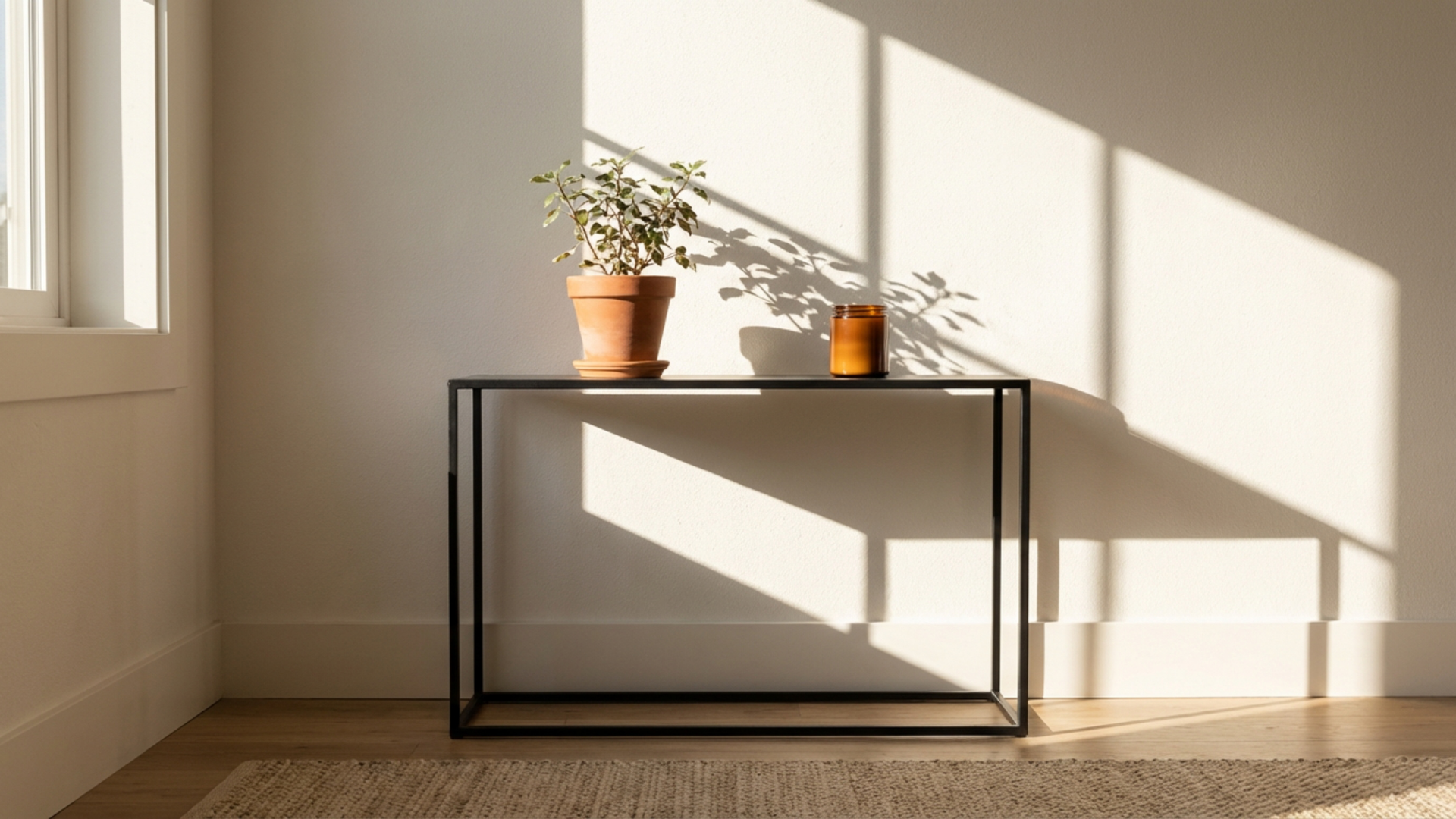
Greige has become a quiet force in interior design, offering a refined alternative to stark gray or traditional beige. This blended hue draws warmth from one side and restraint from the other, creating a finish that feels intentional without demanding attention. When applied thoughtfully, it supports architectural details, furnishings, and natural light rather than competing with them. Many interiors benefit from this balanced presence because it adapts to different environments while maintaining a sense of polish. The appeal comes from its ability to read as neutral without feeling flat or predictable.
Deep, balanced neutrals often bring a high-end feel to a space when used correctly with complementing trim and texture, and this tone fits squarely within that idea. Greige carries enough depth to anchor a space, yet remains open enough to let the various materials and finishes that make up the room speak for themselves. Whether the setting leans traditional or modern, greige has a way of pulling the elements of a room together in a manner that feels deliberate and cohesive.
The Subtle Complexity Behind Greige
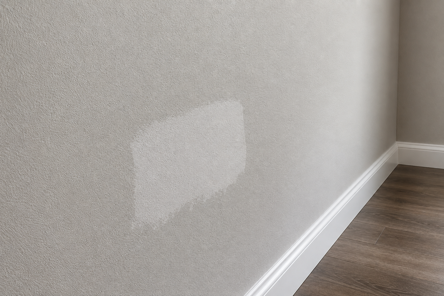
This shade sits at the intersection of gray and beige, but its character goes far beyond a simple mix. Undertones play a significant role in how it presents itself on walls, ceilings, and architectural features. Some versions lean slightly warm with hints of taupe, while others carry cooler notes that echo stone or concrete. That subtle variation allows designers and homeowners to select a finish that aligns with the mood of the room rather than forcing a single interpretation.
Light interacts with this hue in a particularly nuanced way. Morning sun can draw out its warmer side, giving living areas a welcoming glow, while evening lighting may highlight its cooler qualities, lending a composed and tailored look. Because of this interaction, the surface does not feel static. Instead, it shifts gently throughout the day, adding visual interest without relying on bold contrast or dramatic color changes.
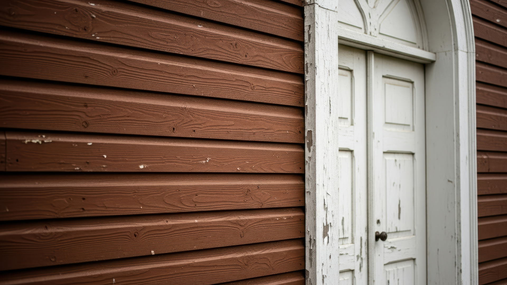
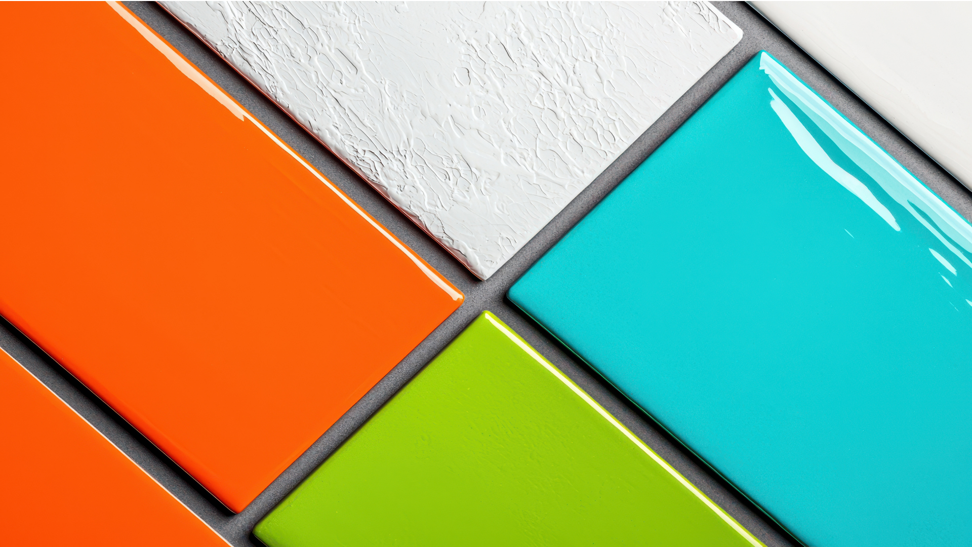
Texture further enhances this complexity. Smooth drywall presents a clean, uniform appearance, whereas plaster, wood grain, or detailed millwork introduce depth and shadow. In spaces with crown molding or paneled walls, the color settles into grooves and edges, emphasizing craftsmanship. This relationship between pigment and surface is a key reason it often reads as elevated when applied by experienced hands.
Pairing With Trim, Materials, And Architectural Details
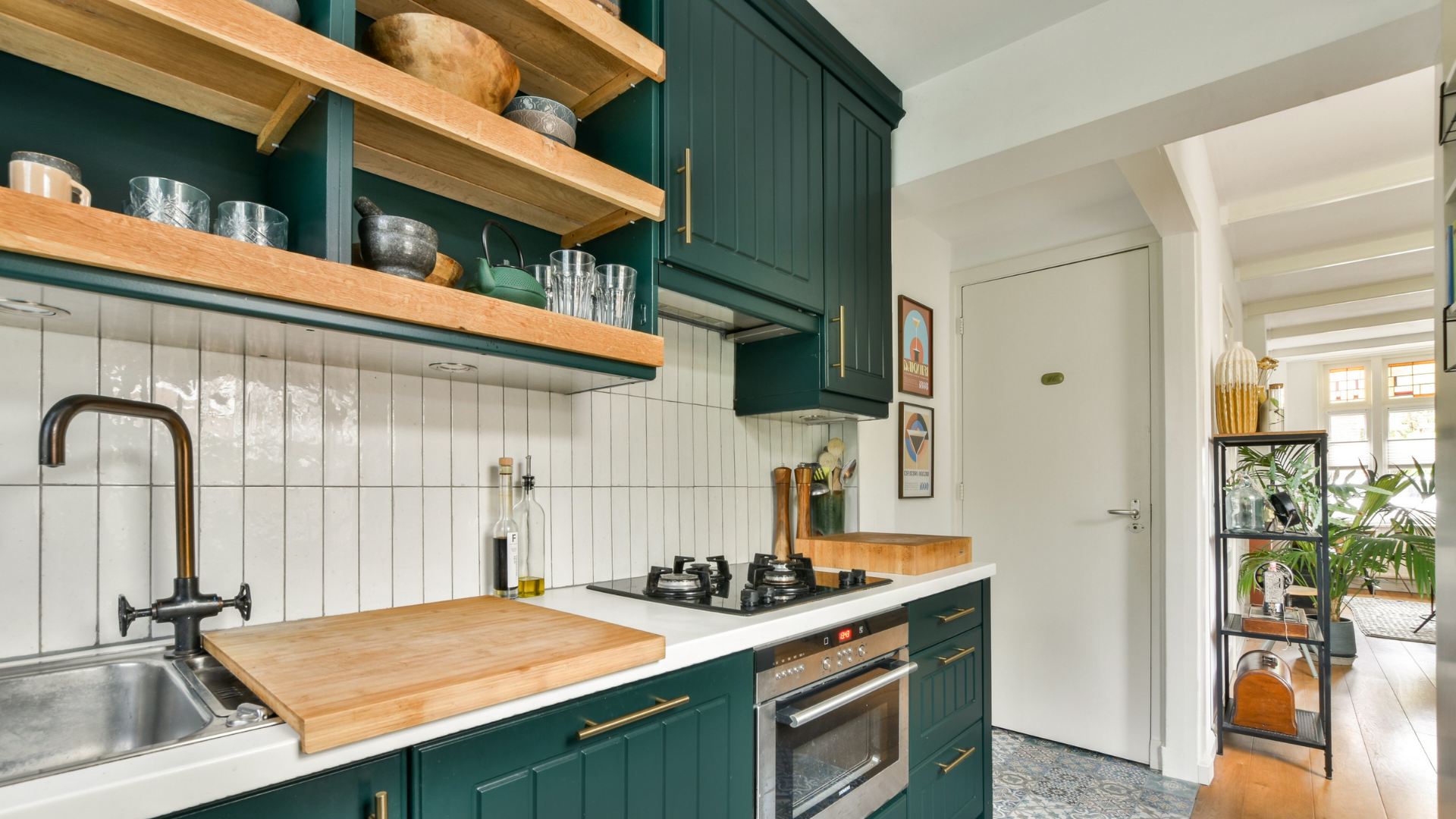
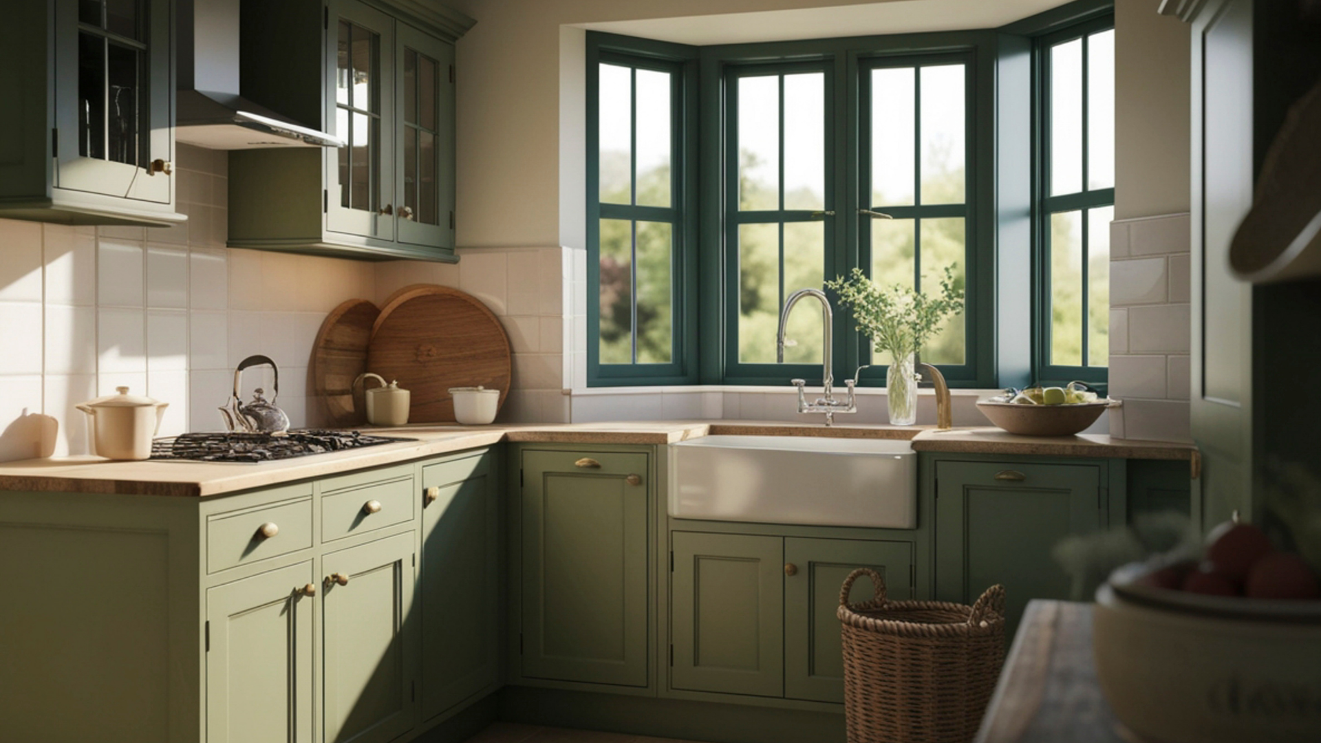
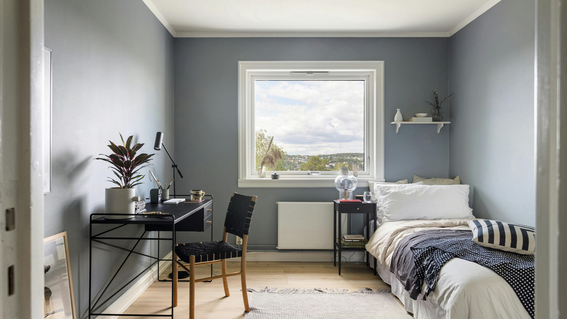
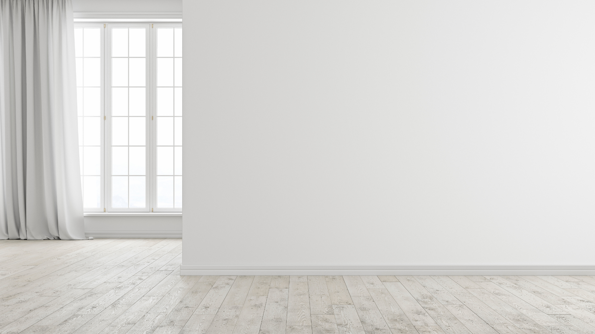
One of the strongest advantages of this hue is how well it works with trim. Crisp white moldings create a classic contrast that feels fresh and intentional, especially in rooms with tall ceilings or detailed door casings. For a softer transition, off-white or cream trim can be used to maintain continuity while still defining edges. Darker trims, such as charcoal or deep brown, introduce drama and work particularly well in studies or dining rooms where a richer atmosphere is desired.
Materials within the space also benefit from this adaptable backdrop. Natural wood, whether light oak or deeper walnut, stands out clearly against the neutral base. Stone surfaces, including marble and quartz, appear more pronounced without feeling cold. Metal finishes like brushed brass or matte black gain clarity, as the surrounding color neither overpowers nor dulls their presence.
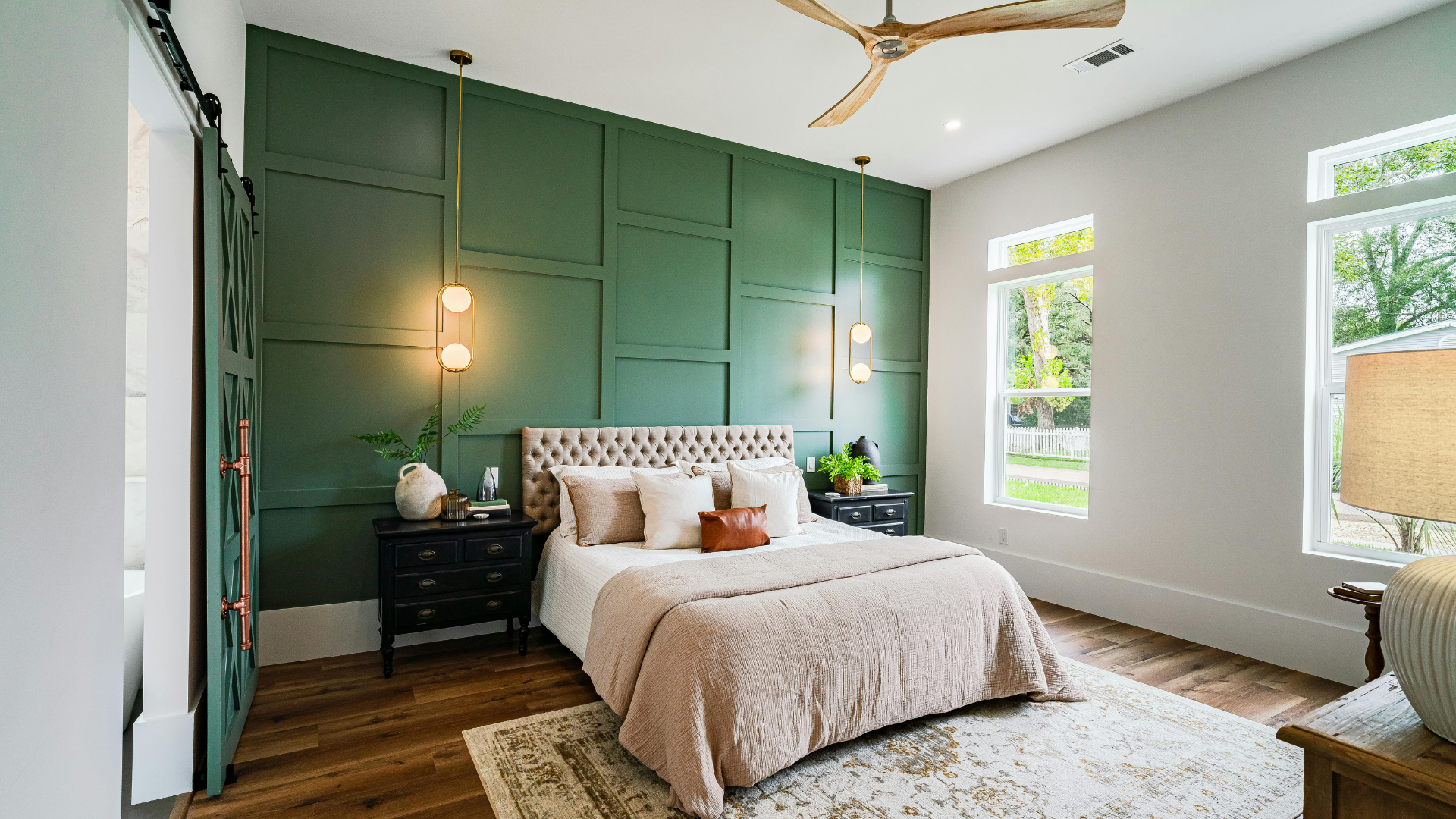
Architectural details deserve special consideration. Built-in shelving, fireplaces, and accent walls take on a sculptural quality when coated in this tone. The color outlines shapes and planes subtly, allowing the structure itself to become part of the design narrative. In open layouts, it helps define zones without relying on sharp visual breaks, supporting a sense of flow throughout the interior.
Creating A High-End Feel Through Application And Finish
Achieving a refined result depends as much on technique as on color selection. Surface preparation lays the foundation for success. Proper sanding, patching, and priming ensure that the final coat appears smooth and consistent, which is essential for deeper neutrals. Any imperfections tend to show more readily on these shades, making attention to detail a critical step.
Selecting the right finish also influences the overall impression. Matte and eggshell finishes offer a soft, understated look that works well in bedrooms and living spaces. Satin or low-sheen options provide durability while reflecting just enough light to enhance depth. In areas like hallways or kitchens, this balance between practicality and appearance helps maintain a polished feel without sacrificing function.
Consistency across adjacent rooms matters. When the same hue is carried through connected spaces, subtle shifts in lighting and layout create natural variation. This continuity supports a cohesive interior while allowing each area to retain its own character. The result feels curated rather than pieced together, which is often associated with higher-end environments.
Why Greige Continues To Resonate In Interior Design
Trends come and go, yet certain tones maintain relevance because they adapt. Greige has shown that kind of staying power. It complements evolving furniture styles, changing decor preferences, and different architectural eras. Homeowners appreciate its ability to support personal expression, whether that means bold artwork, layered textiles, or minimalist furnishings.
There is also a practical aspect to its popularity. Greige provides flexibility for future updates, making it easier to refresh a space without starting from scratch. Walls painted in this neutral can accommodate new accents or finishes with minimal adjustment, which appeals to those who value both aesthetics and long-term planning.
Ultimately, the appeal lies in balance. It offers warmth without heaviness, neutrality without blandness, and sophistication without excess. These qualities explain why it continues to be chosen for interiors that aim to feel both welcoming and refined.
Choosing the right tone and applying it with care can make a meaningful difference in how an interior is experienced. Our team approaches each project with attention to surface preparation, finish selection, and the subtle factors that influence how a color presents itself in real conditions. When you are ready to explore how this timeless hue could enhance your space, don’t hesitate
contact us
today at Gutierrez Painting to discuss your goals, ask questions, or schedule a consultation. We are committed to delivering results that feel natural and aesthetically pleasing from the moment you enter your home.