Why White Paint Is Not Always The Safe Choice
When White Walls Can Feel Cold, Sterile, Or Wrong
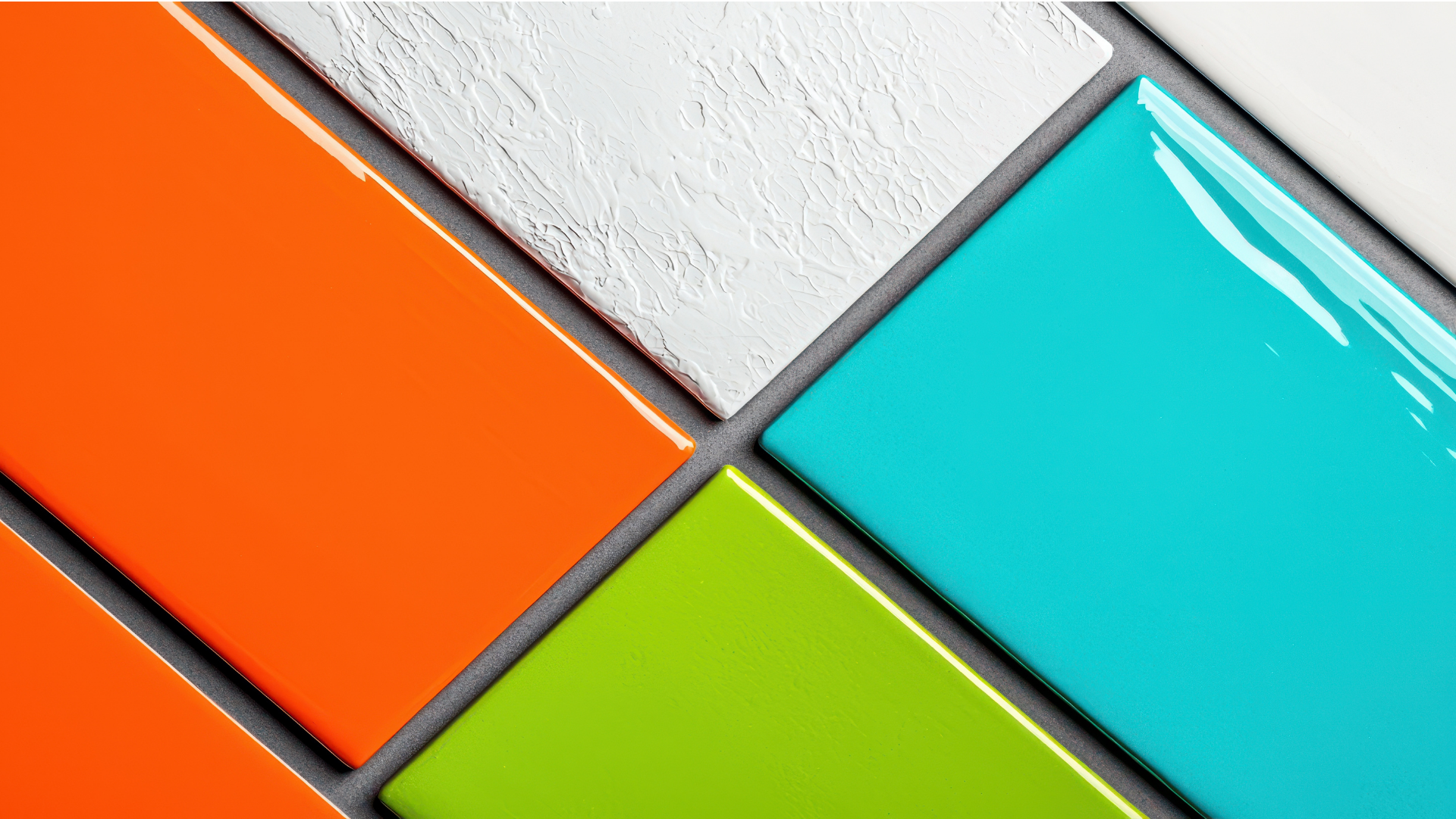
At first glance, white paint feels like the most straightforward choice when planning a new look for your home. It’s clean, it’s simple, and it pairs with nearly anything. Yet when used without intention, an overabundance of it can actually rob a room of character. Instead of opening up a space, too many bright whites can leave it looking flat or even clinical. Walk into a room where every wall, ceiling, and trim is painted in the same blinding shade and the effect can be less cozy retreat and more medical waiting room.
What’s happening here is a kind of visual overstimulation. With no breaks, undertones, or points of contrast, the eye has nothing to rest on. Instead of feeling fresh and breathable, the space can feel washed out. People often assume that the color will automatically make a space brighter, but in reality, it can amplify harshness, especially under direct artificial light. That’s why the “all white equals bigger and better” idea isn’t always as foolproof as it sounds.
The Psychology Of Color
Color influences mood in ways many people don’t notice until they step into a room and instantly feel something. White, depending on its type, can send out very different messages. Pure tones with no warmth can read as crisp but also cold. They strip away softness, making an environment seem less personal. For a kitchen or bathroom where sleekness is the goal, this can sometimes work. In a living room or bedroom, though, the effect may feel unwelcoming.
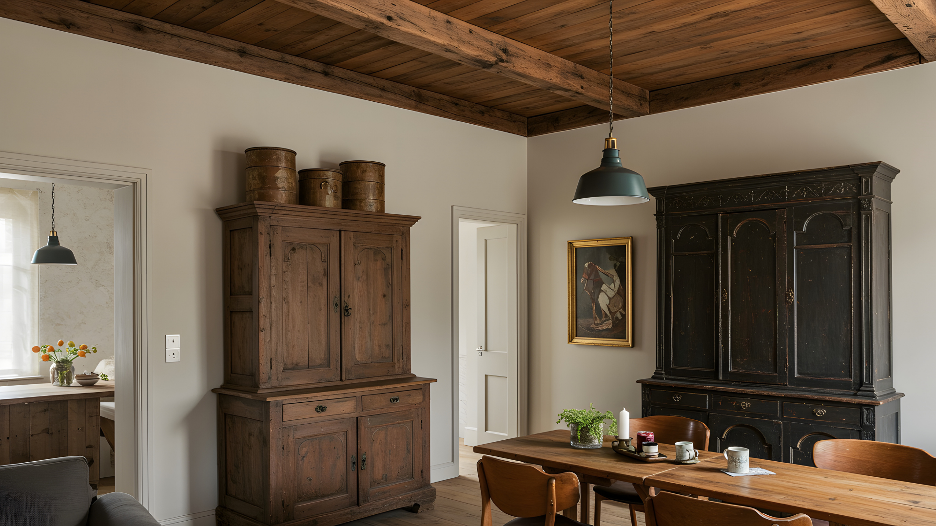
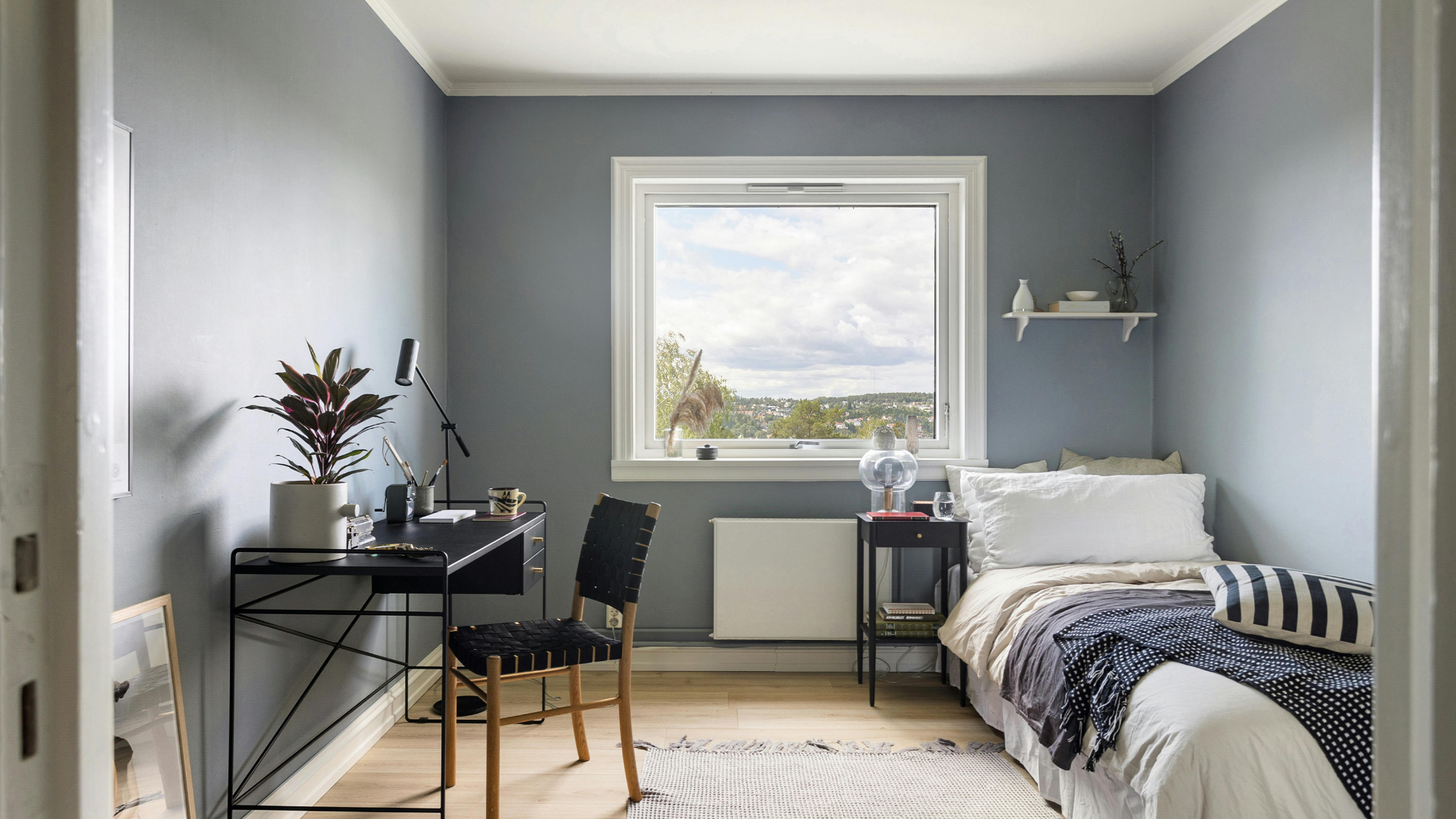
Warm tones, on the other hand, are touched with yellow or beige undertones. They lean toward comfort and approachability, wrapping a space in a subtle glow. These variations often bring out the textures of fabrics, woods, and artwork more naturally than bright whites can. Cool whites, with a touch of blue or gray, walk a fine line between sophisticated and stark. They can look fantastic in modern homes with lots of steel or glass, but if paired poorly, they can feel austere.
The subtle difference in undertones is what gives white its complexity. A swatch on paper may seem identical to another, but when spread across a wall, the effect on mood is strikingly different. That’s why choosing this unique shade without considering its personality often leads to results that feel off once the paint dries.
Lighting And How Colors Shift In Every Space
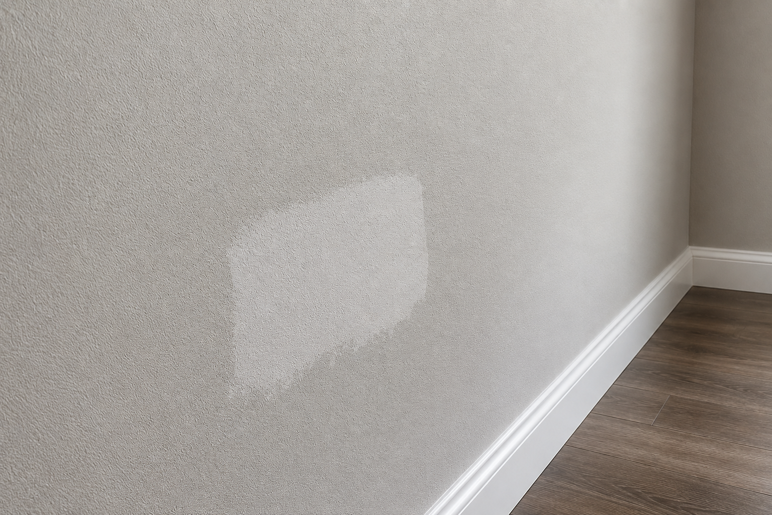
One of the biggest reasons white can misbehave is light. The way sunlight or artificial bulbs hit a wall changes how the color appears. A bright white in a south-facing room flooded with natural light might feel airy and spacious during the day, but the same shade in a north-facing space can appear gray and chilly. Artificial lighting adds another twist. Cool LED bulbs can exaggerate blue undertones, making what looked balanced in daylight suddenly seem icy at night. On the flip side, warm incandescent bulbs can deepen yellow undertones, which might be charming in the evening but overwhelming if the room lacks natural light during the day.
Because of these shifts, it’s common for homeowners to pick a white that looks perfect on a sample card, only to discover it behaves like a completely different color once it’s on the wall. Professionals often test large patches in different parts of a room and watch how they change from morning to evening. It’s a small extra step that makes a huge difference.
When It Works And When It Doesn’t
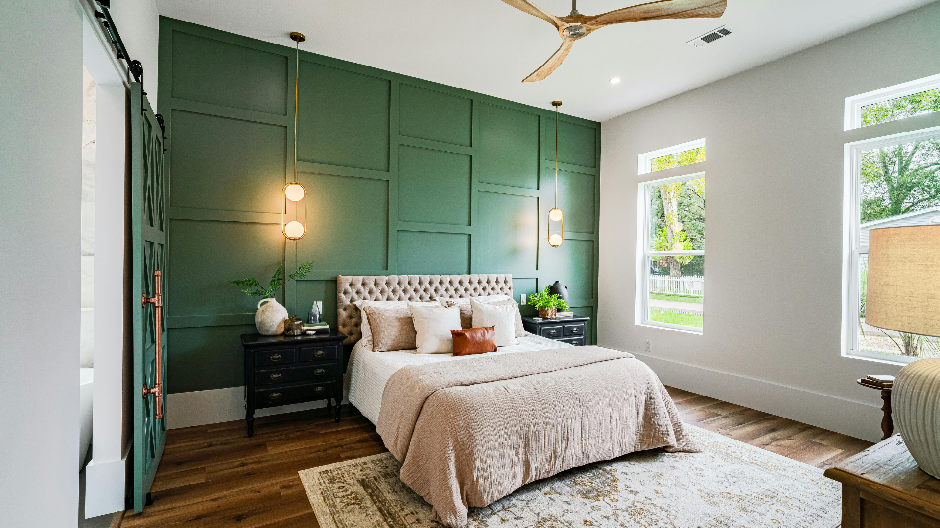
There are moments when white is exactly what a room needs. In spaces with rich wood floors or colorful artwork, white can provide the ideal neutral backdrop that allows other features to shine. It also creates balance in homes where multiple bold tones are already at play. However, when everything in a room competes for attention, relying solely on bright white as the neutralizer can backfire. Instead of calming the scene, it can strip away depth, leaving the space feeling sterile.
Another challenge arises when trim, ceilings, and walls all share the same harsh shade. Rather than framing a room, the trim disappears, flattening the space. Interior painters often break up the palette with subtle variations: a softer warm white on the walls, a slightly brighter white on the trim, and maybe a deeper neutral accent on one wall. These gentle contrasts maintain harmony while preventing that lifeless, one-note effect.
The Role Of Undertones And Professional Balance
Undertones in paint make the difference between a room that feels inviting and one that feels uncomfortably stark. Blue undertones lean cool, yellow undertones lean warm, and gray undertones can create a soft sophistication. Picking the right undertone means paying attention not only to personal taste but also to the existing elements in a room—flooring, cabinetry, stonework, even the type of light bulbs used.
This is where balance becomes key. Professional painters rarely rely on just one version of white in a space. Instead, they pair it with trim in a complementary tone, an accent wall that brings depth, or furnishings that soften its intensity. Even a rug, piece of art, or wooden side table can shift how a wall with so light a shade is perceived. It’s less about avoiding the color altogether and more about understanding how to use it thoughtfully so it feels deliberate rather than default.
Thoughtful Choices Bring Better Results
White paint can be beautiful, timeless, and versatile, but its impact depends heavily on tone, light, and balance. The difference between a space that feels open and one that feels stark often comes down to subtle undertones, lighting conditions, and how the color interacts with the rest of the room. For homeowners, this can be difficult to get right without a trained eye. That’s why leaning on skilled professionals makes the process smoother and the outcome far more satisfying.
At Gutierrez Painting, we understand how to take something as seemingly simple as white and turn it into a carefully considered design choice that complements your space instead of overwhelming it. If you’re planning to refresh your walls and want guidance on which whites will bring warmth, depth, or sophistication to your home, we’d be glad to help. Don't hesitate to contact our team today to discuss your vision—we’ll make sure your home reflects the character and comfort you’re looking for.