Copy of What People Get Wrong About Repainting Cabinets
Why Paint Colors Look Different Throughout The Day
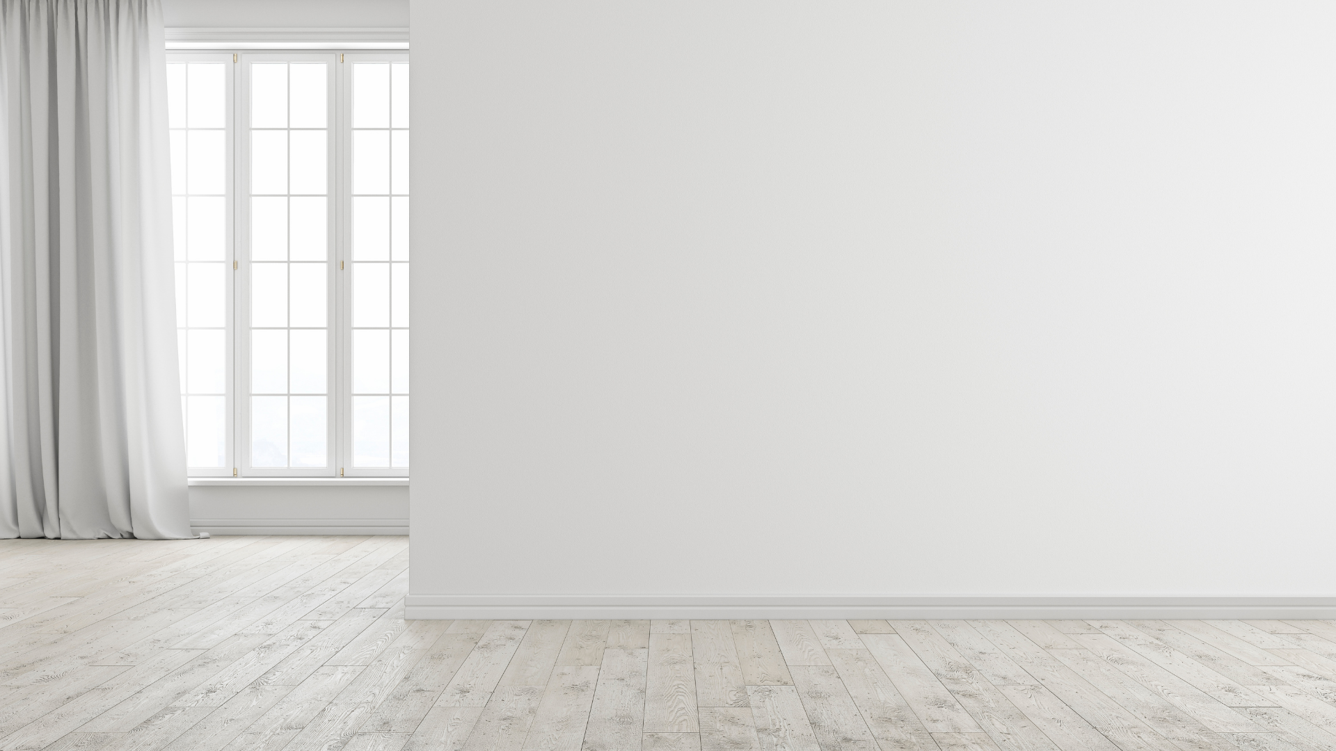
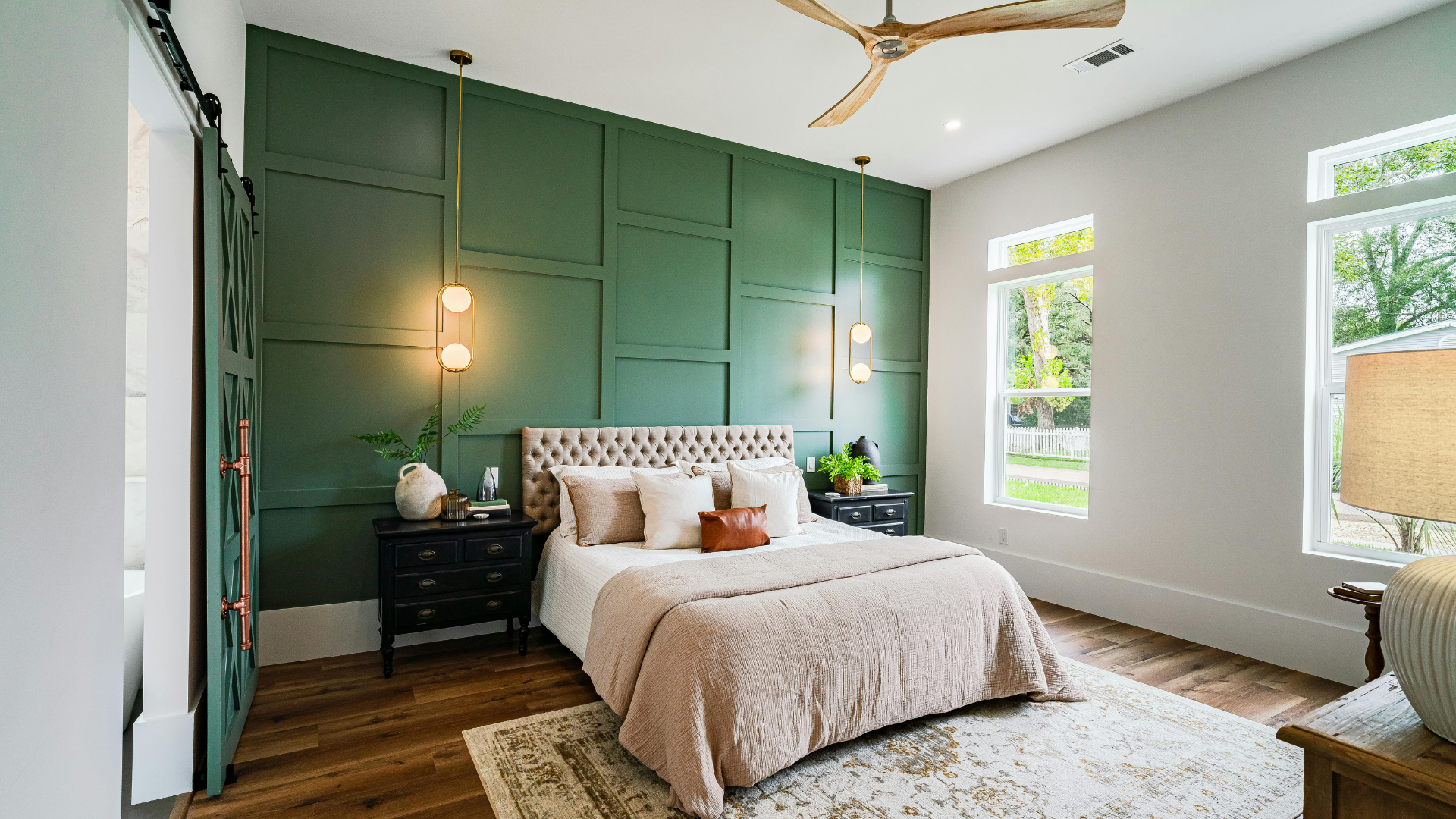
Color selection often feels straightforward when looking at small swatches or digital previews. Yet once a shade reaches an entire wall, the character of that color can shift dramatically throughout the day. Lighting conditions interact with pigments in complex ways, altering brightness, undertones, and visual depth. A warm beige might look creamy in the morning and slightly golden by evening, while a cool gray can swing between soft blue and muted charcoal depending on illumination. Understanding why these shifts happen helps homeowners choose tones that behave well within a specific space rather than relying solely on how a sample appears under display lighting. Sunlight patterns, artificial fixtures, bulb temperature, and the direction a room faces each play a role in shaping the final appearance of painted surfaces.
Natural Light And Its Daily Influence
Natural daylight provides the broadest spectrum of illumination that a room receives. Because of the wide balance of wavelengths this type of glow embodies, it tends to reveal subtle undertones that might stay hidden under indoor lamps. Early morning rays usually arrive with a softer, cooler quality. Blues and greens may appear slightly crisper during those hours, while warmer hues can seem more restrained. As the sun climbs higher, brightness intensifies, and surfaces reflect more light into the room.
Midday conditions frequently produce the clearest view of a paint color's base tone. Walls receive stronger illumination, and shadows become less dominant, which allows pigments to appear closer to their intended formulation. Late afternoon introduces another shift as sunset approaches. That warmer cast can make neutral shades feel richer and deepen the presence of earthy tones like terracotta, clay, or caramel.
These daily variations explain why a color sometimes surprises homeowners after installation. A sample observed during one moment of the day might present a noticeably different personality several hours later. Observing a space over an extended period of time before finalizing a shade gives a more accurate sense of how the finished room will look throughout changing conditions.
Artificial Illumination And Interior Brightness
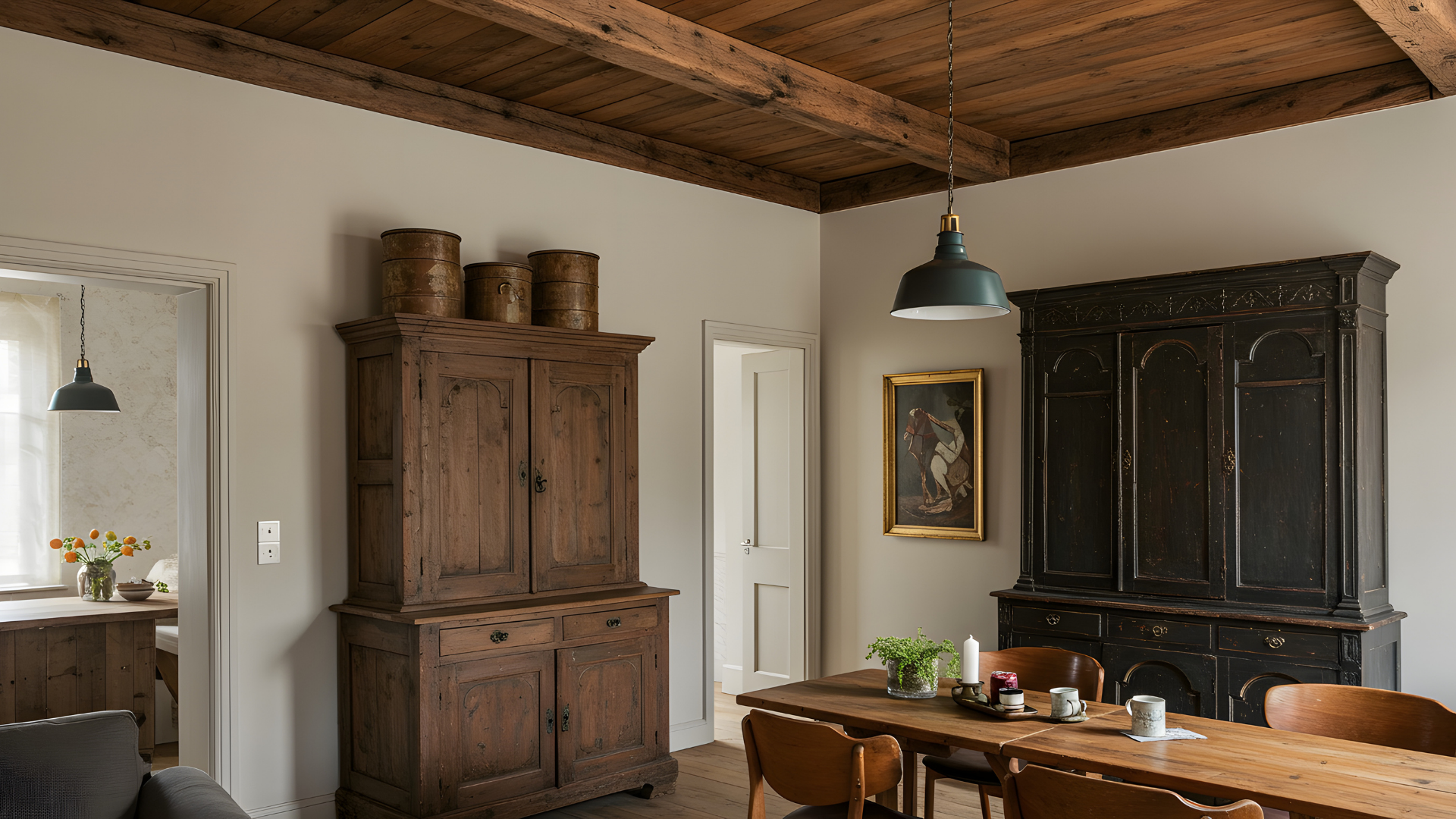
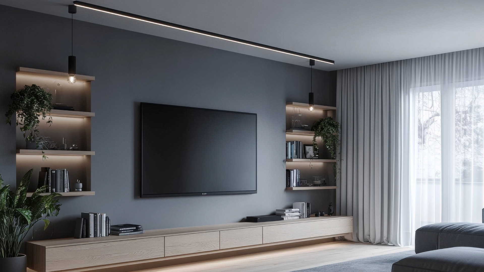
Artificial light sources shape the atmosphere of a space once the sun fades or when windows provide limited exposure. Interior fixtures vary widely in intensity, placement, and diffusion, which means two rooms painted with the same shade can appear quite different at night. Ceiling-mounted bulbs tend to spread brightness broadly, while lamps positioned near walls create localized brightened and shadowed areas that influence perceived depth.
Recessed lighting often produces focused beams that intensify the upper portion of a wall. That concentration may make certain tones look brighter near the ceiling, while the lower portion seems deeper. Pendant fixtures can create a similar effect, but with a softer spread depending on the shade design. Even the material of the fixture influences color perception. Frosted glass diffuses brightness, whereas exposed bulbs produce stronger directional illumination.
Interior lighting also interacts with surrounding surfaces such as flooring, cabinetry, and furniture. Light reflecting off wood floors or countertops carries a hint of those materials back onto the walls. As a result, paint may adopt a slightly warmer or cooler appearance depending on what sits nearby. Recognizing how artificial illumination moves through a space helps prevent surprises once evening arrives.
Bulb Temperature And Color Perception
All bulbs are manufactured with different color temperature ratings, measured in kelvins. This value describes whether the glow it gives off leans toward a warm amber glow or a cooler white tone. Lower temperature bulbs, often labeled warm white, emit a gentle yellowish cast that enriches reds, creams, and warm neutrals. In rooms illuminated primarily by those bulbs, beige might appear deeper, and taupe may lean slightly golden.
Higher temperature bulbs shift the atmosphere toward a cooler appearance. Natural or cool white bulbs introduce a bluish clarity that sharpens contrast and reveals cooler undertones. Grays can appear more steel-like, while pale blues become brighter and more defined. That clarity may be desirable in workspaces or kitchens where crisp visibility is valued.
Mixing bulb types within a single room sometimes produces inconsistent visual results. A table lamp with a warm bulb paired with cooler ceiling bulbs can cause sections of the same wall to display subtle color differences. Coordinating bulb temperatures within a space allows the chosen paint tone to maintain a more balanced presence regardless of which fixtures are active.
Room Orientation And Directional Placement
The direction a room faces influences how the sun enters and how long it remains during the day. Spaces oriented toward the east receive gentle morning brightness followed by softer conditions later in the afternoon. Colors in those rooms may appear lively early in the day, yet calmer once the sun moves overhead.
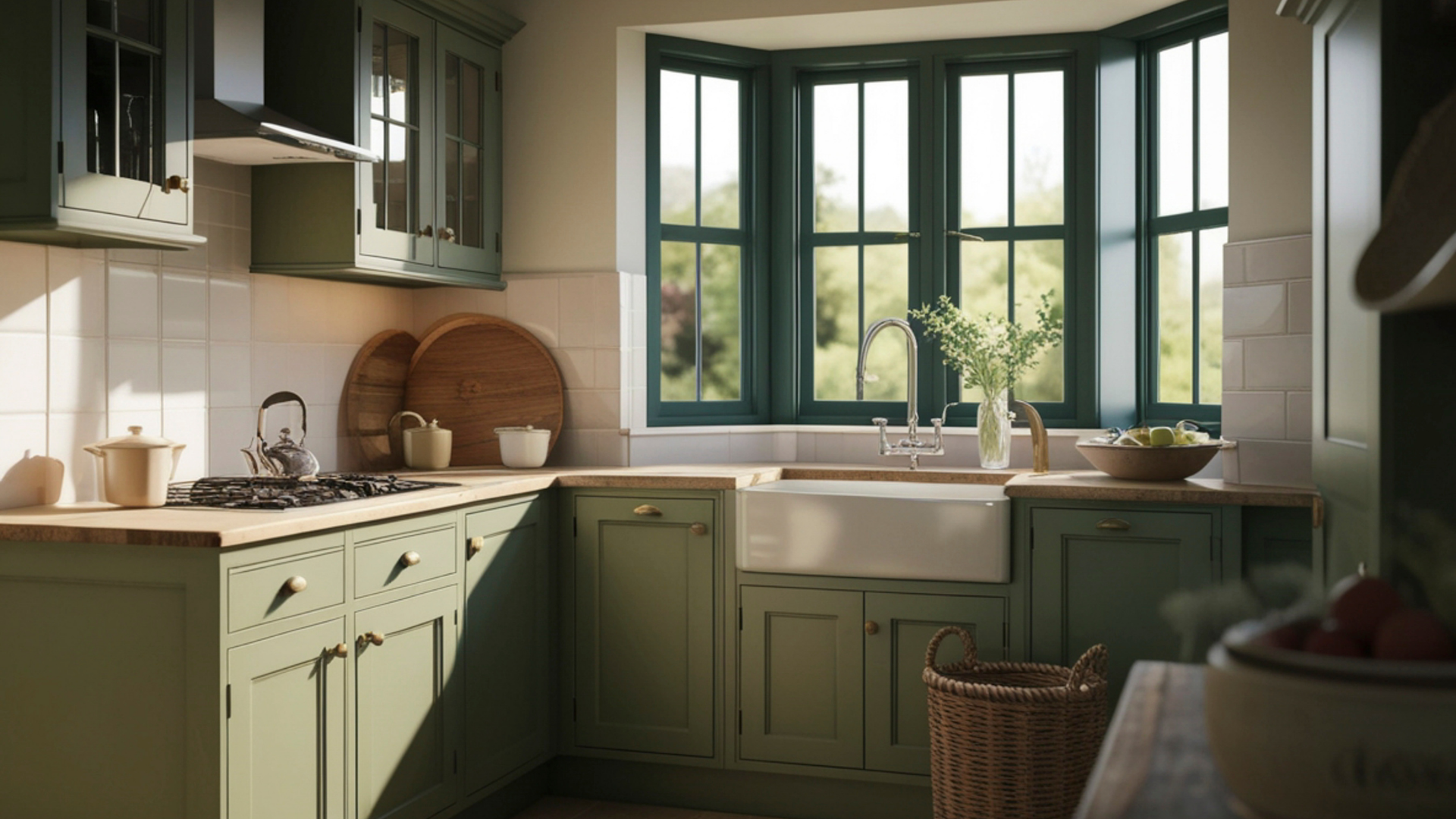
South-facing areas usually experience stronger daylight for a longer portion of the day. Consistent illumination tends to make hues look brighter and slightly warmer because of the steady flow of natural light. Paint with subtle undertones often becomes easier to interpret in these spaces since shadows remain minimal for much of the daylight period.
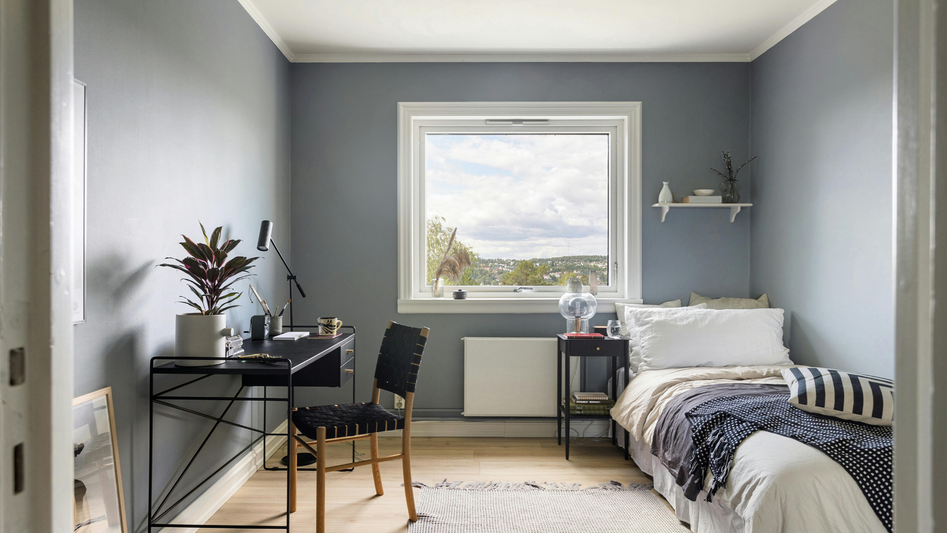
North-facing rooms typically receive cooler, indirect daylight. That environment can emphasize blue or gray undertones within many paint families. A shade that appears neutral in a sunlit display space may seem cooler when placed on a north wall. West-facing spaces provide the opposite pattern, beginning the day with softer brightness before filling with a warmer sunset glow later in the afternoon. Understanding these directional patterns helps guide thoughtful color selection.
Choosing a paint color involves more than matching a swatch to furniture or trim. Light acts as a constant partner in shaping how that color is perceived from morning through evening. Sun angle, fixture placement, bulb temperature, and room orientation each influence the way pigments express themselves on a wall. Taking these factors into account during the planning stage helps ensure that the finished space reflects the mood and atmosphere a homeowner expects when the project is complete.
Professional guidance can make that process far easier. An experienced painting team understands how different lighting conditions interact with modern paint formulations and can recommend shades that perform well within a particular environment. If you‘re considering a fresh interior update and want results that look exceptional throughout the day,
contact us
today at Gutierrez Painting to discuss your project and schedule a consultation.