What Paint Color Makes A Small Room Feel Bigger
Color Techniques That Trick The Eye In Tight Spaces
Color can play a remarkable role in how a room feels, especially when square footage is limited. People often look at the walls of their home and feel like they’re stuck with a set of colors that clash with the shape and layout of the space, yet paint has a quiet influence that can reshape how an entire room is perceived. The right shade can stretch the walls, soften shadows, and create a more comfortable atmosphere. When you understand how light interacts with pigment, it becomes easier to design a setting that appears more generous than the blueprint suggests.
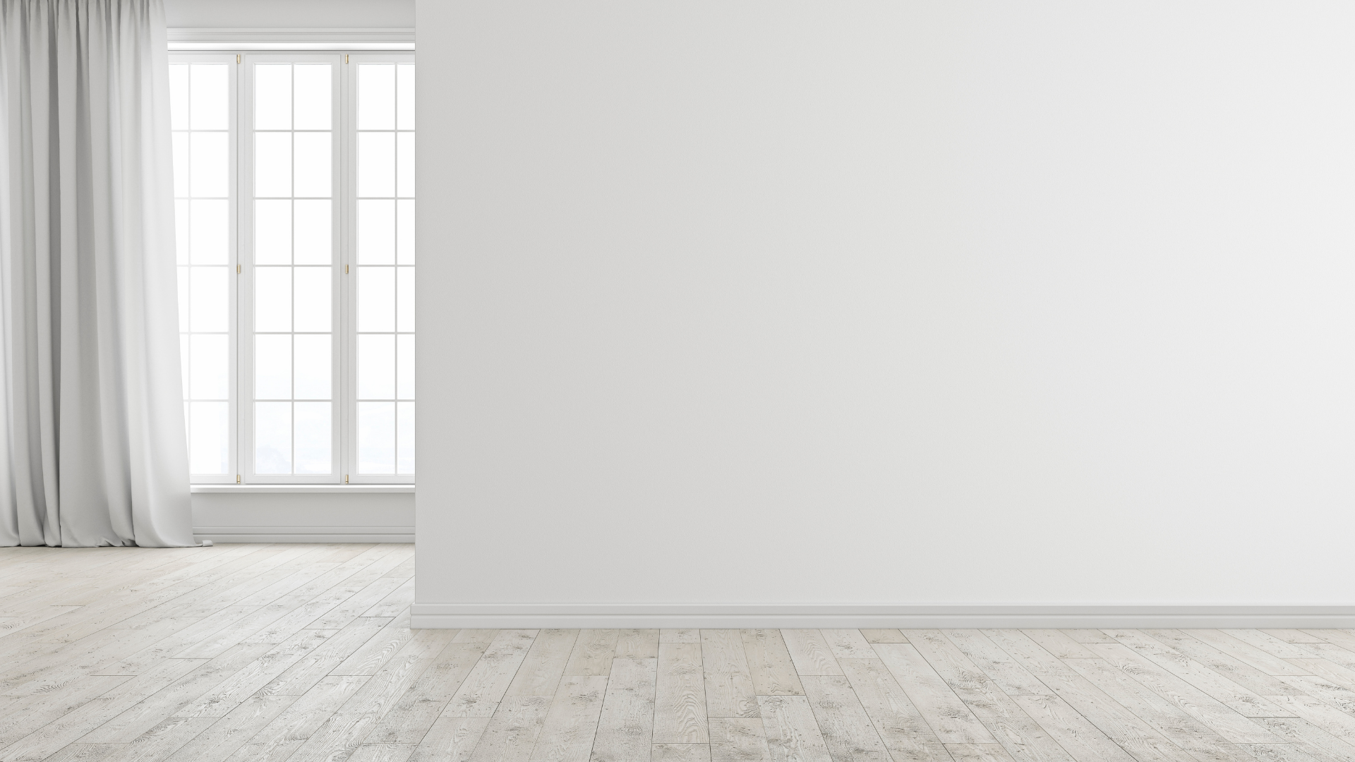
Lighter hues and cooler tones are widely known for their ability to brighten a space, but there’s more going on than simple brightness. These shades influence how the eye interprets distance. When a surface reflects more light, the edges blur slightly into the ambient glow, and the whole space begins to feel airier. That sense of openness can turn what might seem like a cramped corner into an area with more freedom of movement. Clean, crisp edges further enhance this effect by sharpening lines in a way that guides vision along smooth, uninterrupted paths.
Even though space can’t physically expand, a thoughtful approach to color gives it a renewed identity. The walls start behaving differently, depth becomes more pronounced, and the area feels easier to navigate. It’s a subtle shift that shapes how you experience your home each day, and paint becomes the tool that makes it possible.
Why Lighter Tones Have An Expanding Effect
Light has a direct impact on how we interpret size, and colors that reflect light help amplify that sense of space. When you coat the walls in soft whites, pale creams, airy grays, or faint pastels, you’re giving the space an opportunity to disperse natural and artificial light evenly. Instead of gathering shadows in corners or losing detail in darker patches, the entire area starts working together in a balanced glow.
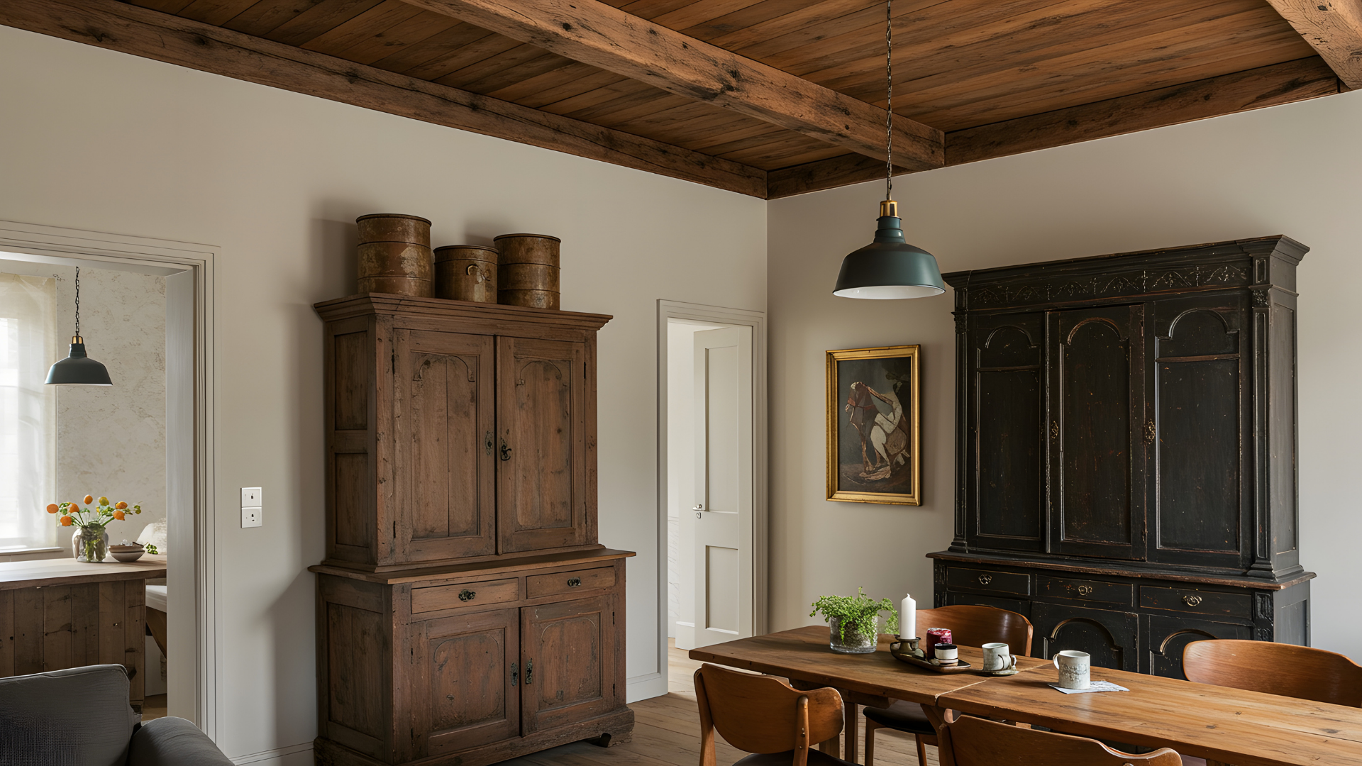
These shades lift visual weight from the walls. Darker colors can look beautiful in the right setting, yet they pull surfaces toward the eye and can make the boundaries feel closer than they actually are. Lighter tones do the opposite. They push the walls outward visually and create a continuous surface that doesn’t interrupt the flow of light. That gentle push adds depth without calling attention to it.
Soft hues also help smooth transitions from wall to wall, which can prevent the eye from stopping at abrupt visual borders. When the gaze keeps moving naturally, the room feels more open than it might on paper. The mind interprets uninterrupted movement as added square footage, even if the footprint remains unchanged.
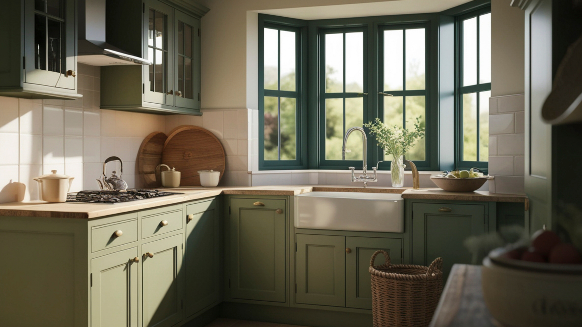
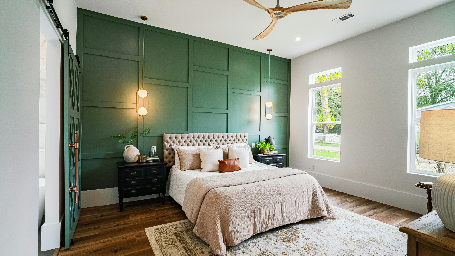
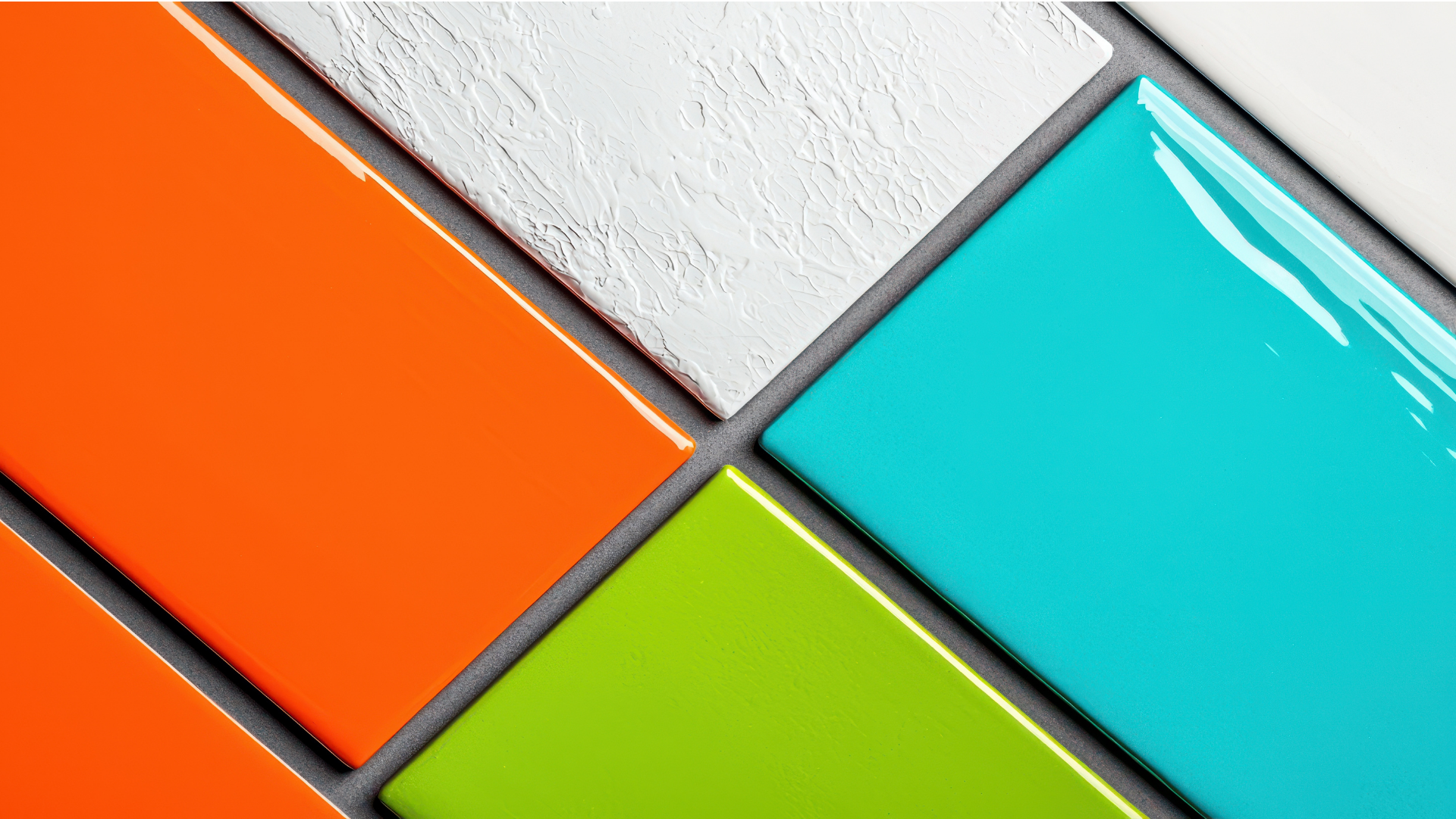
It’s worth noting that the character of a lighter shade matters as well. Some whites, for instance, carry warmer undertones that can bring a cozy glow to a small room. Others lean cooler and contribute a more serene atmosphere. Both can be effective, and the best choice often depends on how much sunlight the room receives, as well as the mood you want to set. Soft blues, delicate greens, and gentle grays give a refreshing lift that works particularly well in compact bedrooms, bathrooms, and office spaces.
How Cooler Colors Influence Perception And Calm
Cooler tones carry a sense of distance because of the way we interpret colors found in nature. Think of how faraway mountains appear slightly blue, or how the horizon softens into a pale gray as the eye moves toward the distance. These visual cues create a built-in association between cooler shades and openness. When you bring those tones indoors, they evoke a similar response.
A small room painted in a light blue, soft green, or muted gray often feels more relaxed than one coated in a deeper, warmer tone. These cooler colors recede gently into the background, encouraging the eye to travel further rather than stop abruptly at the walls. This gives the impression of extended space and a smoother visual experience overall.
Another advantage of cooler tones is their calming presence. Smaller rooms can sometimes feel busy, especially if they’re used frequently throughout the day. Cooler shades counteract that busyness with a sense of quiet movement. They soothe visual clutter and help the room settle into a more peaceful rhythm. When the mind feels at ease, the area naturally appears larger.
Pairing cooler shades with natural light can produce an especially striking change. Sunlight tends to enhance the airy qualities of these colors, while artificial lighting can be adjusted to highlight subtle undertones. The result is a room that feels lively without being overwhelming, expanding its character in a gentle, understated way.
Why Clean Edges Contribute To A More Open Visual Field
When aiming to make a small space feel wider or taller, clean lines can make a notable difference. Crisp, well-defined edges create a sense of clarity that helps the eye understand the room’s shape more efficiently. Instead of wandering across uneven borders or visual distractions, the gaze moves confidently from one surface to the next.
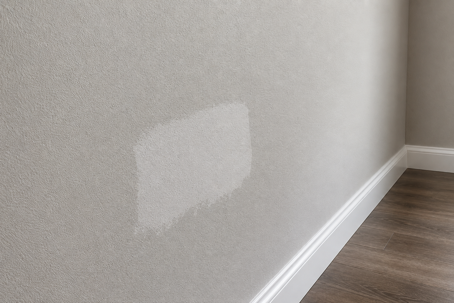
A sharply cut line between wall and ceiling allows those planes to register as distinct surfaces. When those planes remain clear, the mind interprets the room as more structured and more open. Fuzzy or inconsistent edges can add visual noise, which can make a compact space feel slightly chaotic. Clean edges, on the other hand, support an organized environment, helping every color perform at its best.
Precision around trim, corners, and window frames also plays a part. When these small architectural elements look tidy, they reflect more intentionally against lighter or cooler shades. This creates a crisp visual hierarchy within the room, guiding attention where it belongs rather than distracting from the overall sense of space.
Even if you choose very light or cool hues, the finish won’t feel as effective without those smooth boundaries. The details matter. Paint behaves like a visual frame, and when the frame is crisp, the room looks more composed and therefore larger. It’s a subtle effect, yet one that enhances the entire atmosphere.
A compact room can gain a fresh sense of openness through thoughtful color choices and careful application. Lighter hues reflect the surrounding illumination, cooler tones create a feeling of distance, and clean, defined edges make an area feel more polished. When all three elements work together, the result is a space that feels brighter, more relaxed, and far more welcoming.
If you’re looking to refresh a part of your home and want a result that genuinely boosts the feel of the room, it's time to bring our team in to help. Our team can help you choose the tone that supports your vision and apply it with precision that elevates the entire space.
Contact us today to begin transforming your home with color that truly enhances your environment.