Kitchen Cabinet Color Vs Wall Color Decisions
Choosing Between Matching Or Contrasting Kitchen Cabinet And Wall Colors
Coordinating the tone of the cabinets and walls shapes the visual balance, depth, and overall atmosphere of a kitchen space. The look and feel of a kitchen often hinges on color decisions more than any other design element. Cabinetry and walls occupy the largest visual areas, so how they interact can either create harmony or introduce tension. Some homeowners lean toward a unified palette that blends everything in a given part of their home together, while others prefer contrast that highlights different surfaces. Both directions can produce striking results, but the choice requires thoughtful consideration of space, lighting, and overall design intent.
Understanding The Impact Of Matching Versus Contrasting
When multiple parts of a room match hues, the result is a smooth, continuous appearance that allows the kitchen to feel calm and cohesive. This approach reduces visual interruptions, making the room appear more expansive. In smaller kitchens, this effect can be especially beneficial, as fewer contrasting elements help prevent the space from feeling crowded. The eye moves easily across surfaces, creating a gentle sense of flow.
However, a monochromatic scheme also comes with tradeoffs. Without variation, the space may lack dimension, particularly if the finishes and materials do not introduce subtle differences. Architectural features such as molding, shelving, or unique cabinet profiles may not stand out as much when everything shares a similar tone. This does not mean any matching parts of a room lack personality, but it does mean that texture, lighting, and accents must carry more of the visual interest.
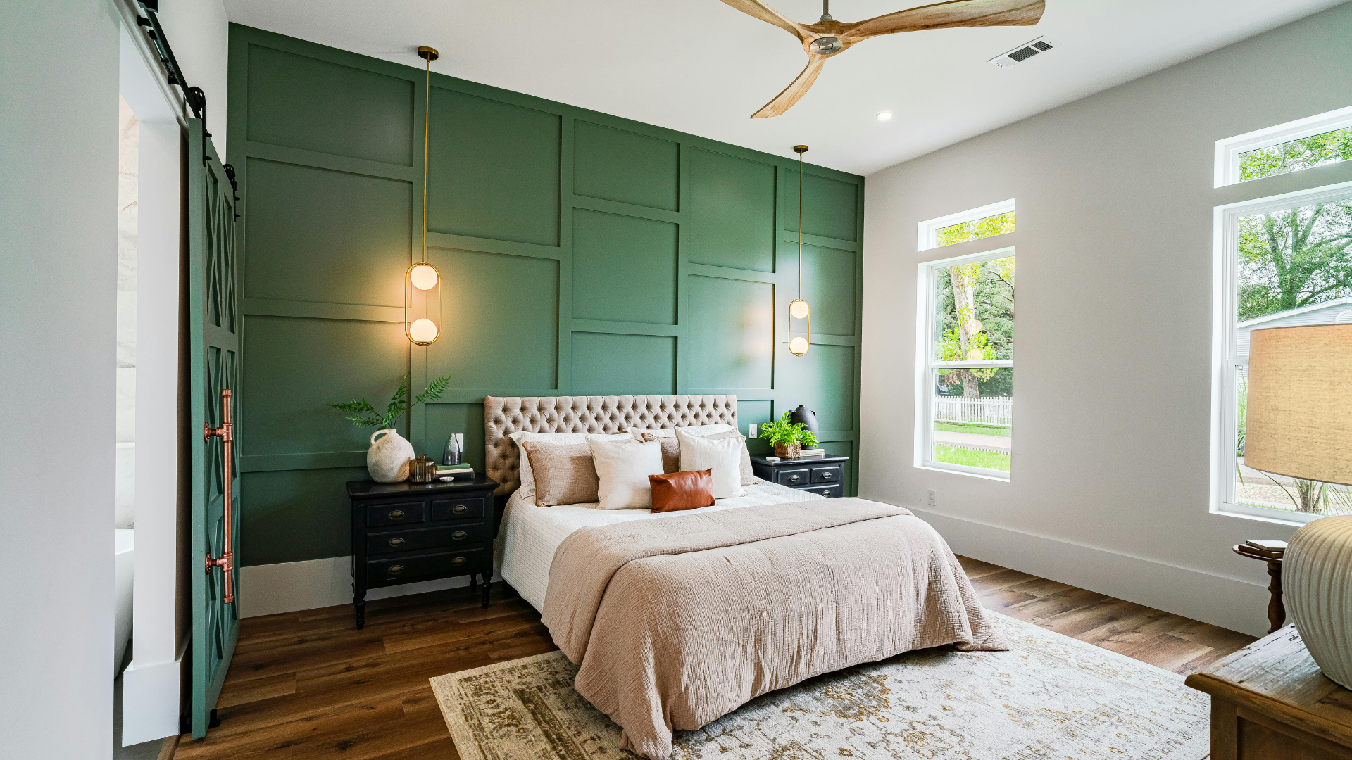
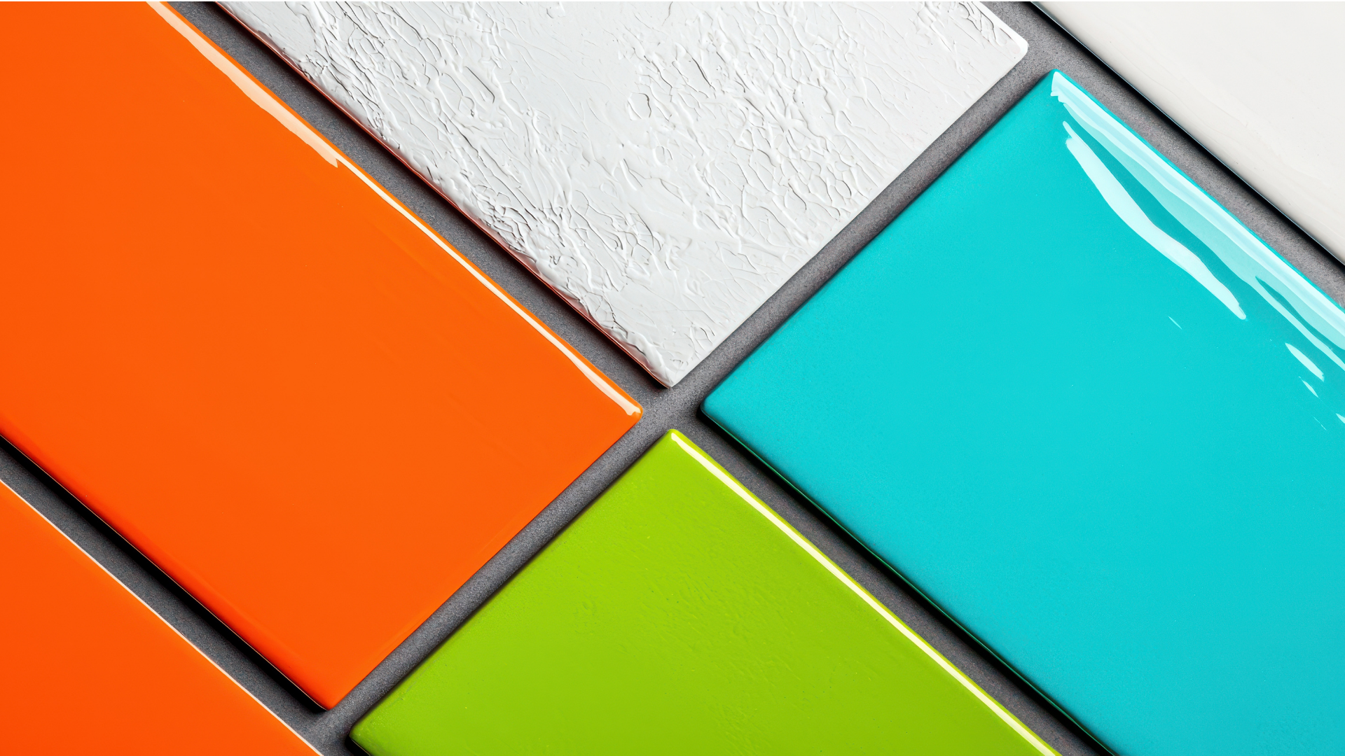
On the other hand, contrasting cabinet and wall hues bring energy and structure into the design. By using different tones, the space gains depth and definition. Cabinets can become focal points, while walls serve as a complementary backdrop. This approach allows for more creativity, as combinations can range from soft and understated to bold and dramatic.
Contrast also helps define zones within a kitchen, particularly in open layouts where the cooking area blends into dining or living spaces. A shift in shade can subtly signal transitions without the need for physical barriers. That said, strong contrast requires balance. If colors clash or feel disconnected, the space can appear disjointed rather than intentional.
Exploring Popular Pairings And Design Strategies
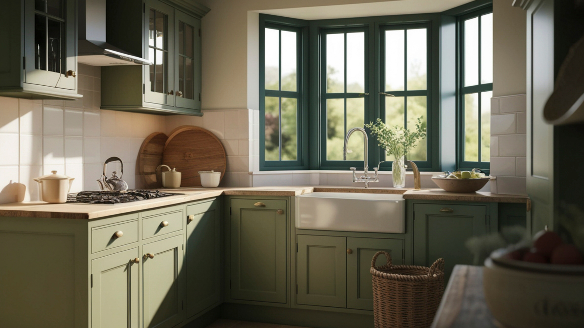
Light cabinets paired with darker walls create a grounded look that adds sophistication without overwhelming the space. The darker background can make cabinetry appear brighter and more prominent, drawing attention to craftsmanship and detail. This combination works well in kitchens with ample natural light, where darker tones do not make the room feel closed in.
The reverse pairing, with dark cabinets and lighter walls, remains a classic choice. Light walls reflect more light, helping to offset the visual weight of darker cabinetry. This approach creates a sense of contrast while maintaining an airy atmosphere. It is particularly effective when the cabinetry serves as a statement feature, such as rich wood finishes or deep painted hues.
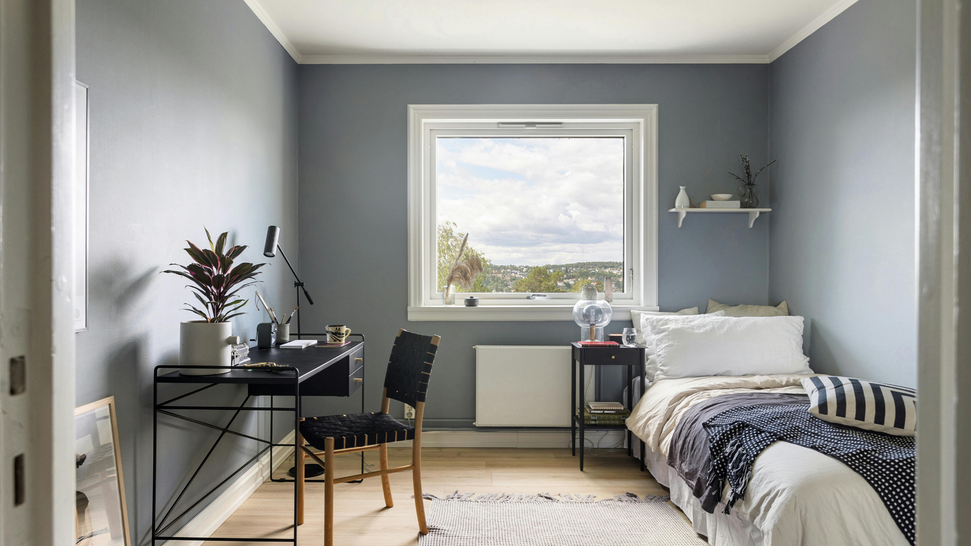
Neutral combinations offer another route for achieving balance. Shades of white, beige, gray, or muted earth tones can be layered in a way that introduces variation without stark contrast. These palettes tend to feel versatile and adaptable, making it easier to update other elements of the kitchen over time. Subtle shifts in undertones can add complexity without overwhelming the overall design.
Lighting plays a crucial role in how these pairings appear. Natural light changes throughout the day, altering the perception of color and depth. A shade that looks warm in the morning might appear cooler in the evening. Artificial lighting adds another layer of influence, as different bulb types can shift tones toward warmer or cooler tones. Evaluating samples under various lighting conditions helps prevent surprises once the project is complete.
How Space, Materials, And Finishes Shape A Space
The size and layout of a kitchen significantly influence how color choices are perceived. In compact spaces, lighter tones and minimal contrast often help maintain a sense of openness. When cabinets and walls share similar hues, the boundaries between them become less defined, which can make the room feel larger than it is. In larger kitchens, contrast can add structure and keep the space from feeling too expansive or undefined.
Open-concept designs introduce another layer of complexity. The kitchen must connect visually with adjacent areas, so color choices should consider the broader environment. A strong contrast that works well within the kitchen may feel disconnected if it clashes with nearby spaces. Coordinating tones across different areas helps maintain a cohesive look throughout the home.
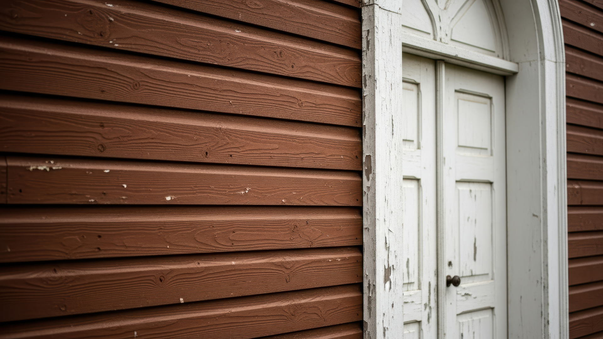
Material selection also plays a key role. Matte finishes absorb light, creating a softer appearance, while glossy surfaces reflect light and can make colors appear more vibrant. The texture of cabinetry, whether smooth, grained, or detailed, influences how color is perceived. Even subtle variations in finish can add depth to a monochromatic scheme or enhance the contrast between different elements.
Countertops and backsplashes act as bridging elements between cabinets and walls. Their colors and patterns can either reinforce the chosen palette or introduce additional layers of interest. For example, a backsplash that incorporates tones from both cabinets and walls can tie the entire design together. Ignoring these elements during color selection can lead to a disjointed appearance, even if the primary colors are well chosen.
Balancing Trends With Long-Term Design Value
Kitchen color trends shift as design preferences evolve. Bold cabinet colors, two-tone schemes, and unexpected pairings have gained attention in recent years. While these trends can create a distinctive look, it is worth considering how they will age within the space. A design that feels exciting today might not carry the same appeal in a few years.
Common mistakes often arise during the decision-making process. Choosing colors without testing samples can lead to unexpected results once the paint is applied across larger surfaces. Undertones can clash even when colors appear similar at first glance, creating subtle but noticeable discord. Overcomplicating the palette with too many competing shades can also detract from the overall design.
Both matching and contrasting cabinet and wall colors can create a compelling kitchen when approached thoughtfully. The key lies in understanding how this decision influences space, light, and the overall design of a space. By considering factors such as layout, materials, and long-term goals, it becomes easier to select a palette that enhances the kitchen’s character. For homeowners seeking expert guidance and a refined finish, don't hesitate to
contact us today at Gutierrez Painting for professional insight and craftsmanship that will bring your kitchen to life.